09-07-2026: how I celebrated my birthday
June 22, 2026.
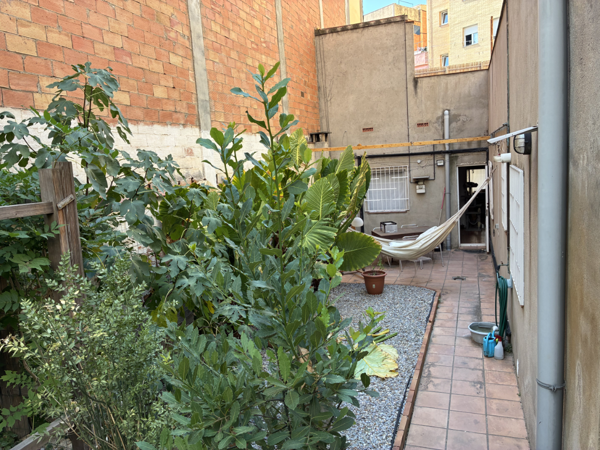
Leading up to the big day: It’s summer in Barcelona. I’m sitting outside in my hammock, fairly early in the morning. With coffee and a book... Soon, the sun will rise over the houses and it will get too hot.

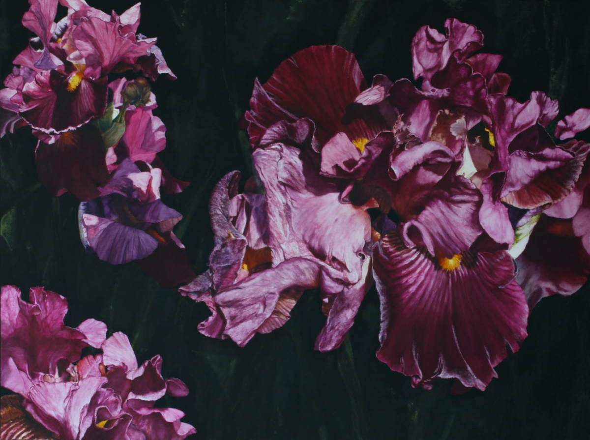
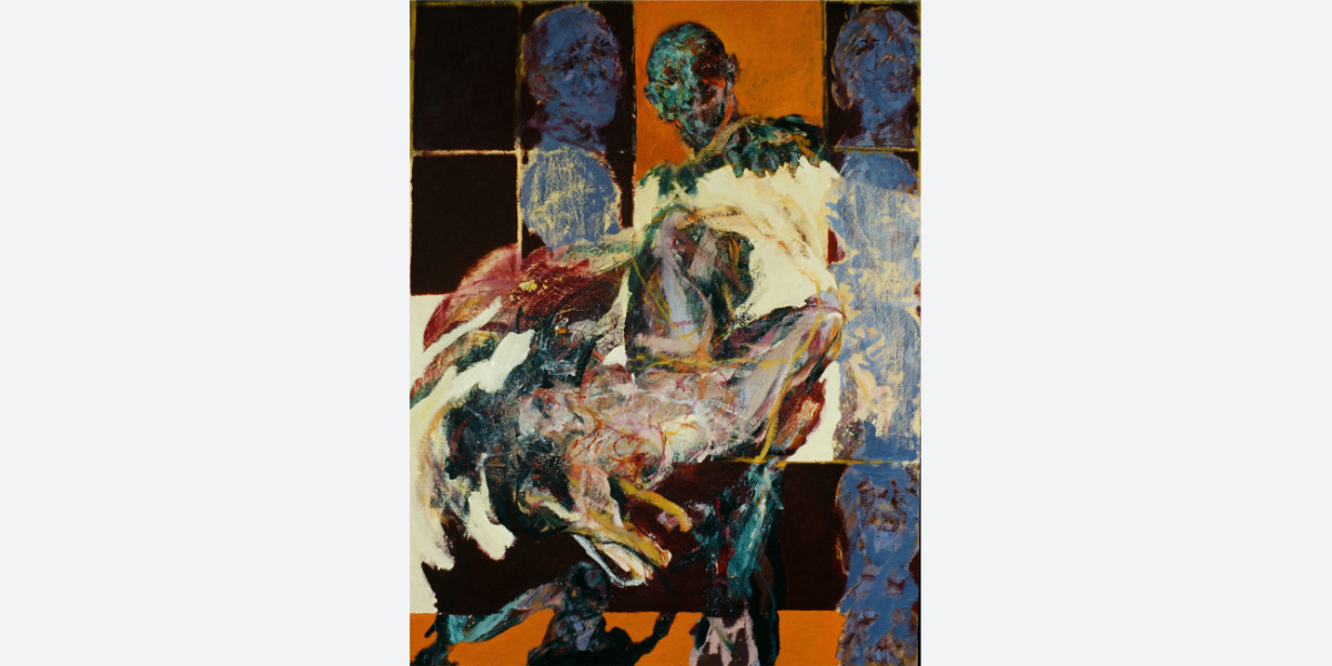
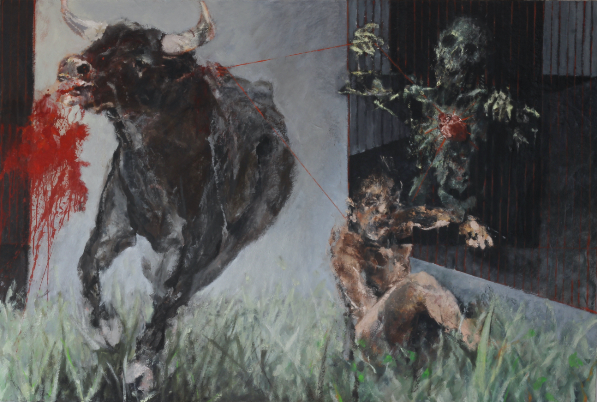
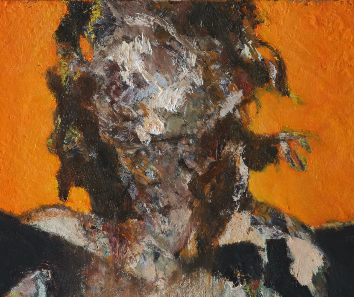
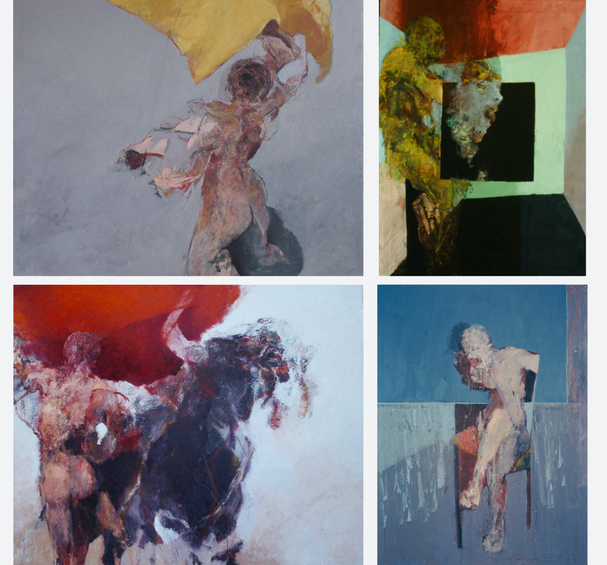
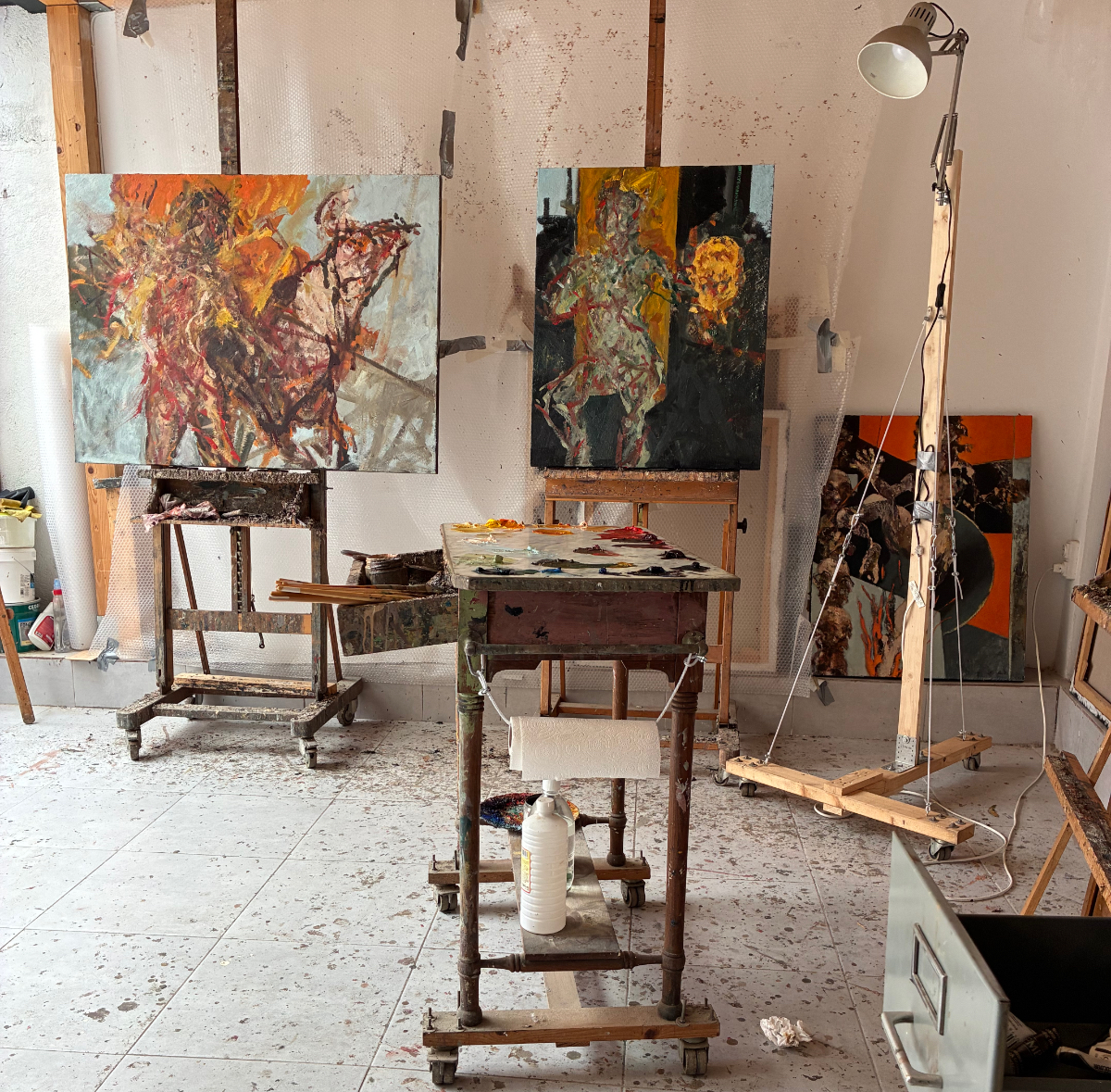
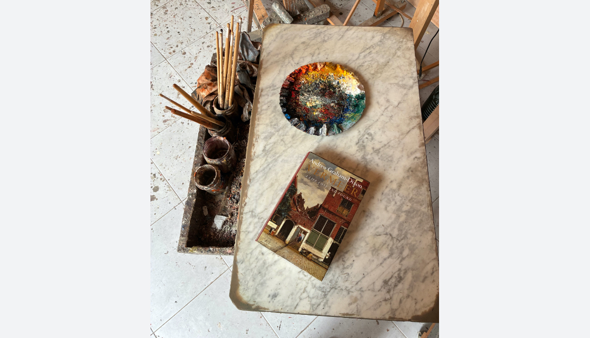
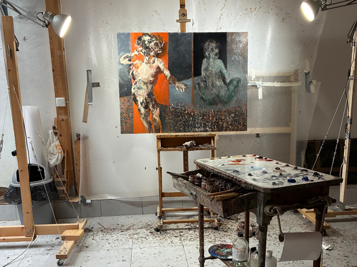
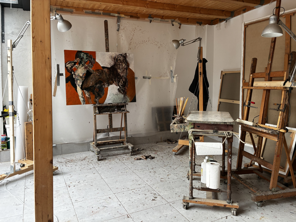
Then it’s time to head into the studio, wearing a wet T-shirt with the fan on full blast. That way, I can get some decent work done in the shade. I am working on a 'FLOWER' canvas. After the passing of two dear friends (one during my holiday in France), I had to paint away my sense of loss. This happened in the last three 'FIESTA' works. Grief seems to put me in the right mood, preventing me from adding frills and getting to the essence faster.
I hate displaying overly personal misery. That often turns into pathos. By the way, I was just wondering if you can cry carefully.
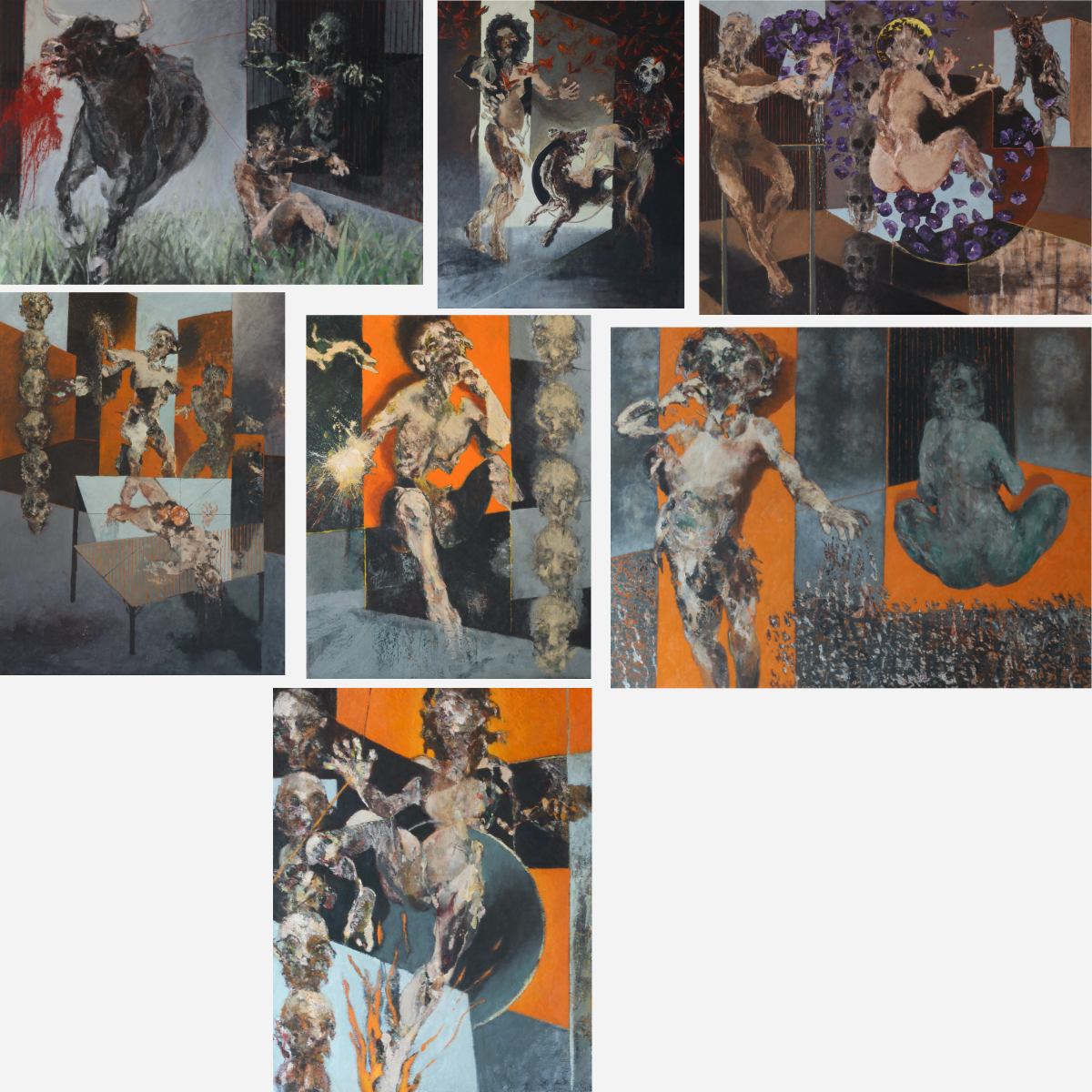
(The video of 'LIFE IS A CARNIVAL AND NINE FIESTA PAINTINGS' has been viewed by more than 800 people via LinkedIn; I can be satisfied). Click on the title to go to the video.
After what was intended to be the final 'FIESTA' canvas for the moment, I wanted to breathe more freely and distance myself from my nightmares. That is why I started a 'FLOWER' painting; a work capturing light, a riot of color, and beauty untouched by human hands.
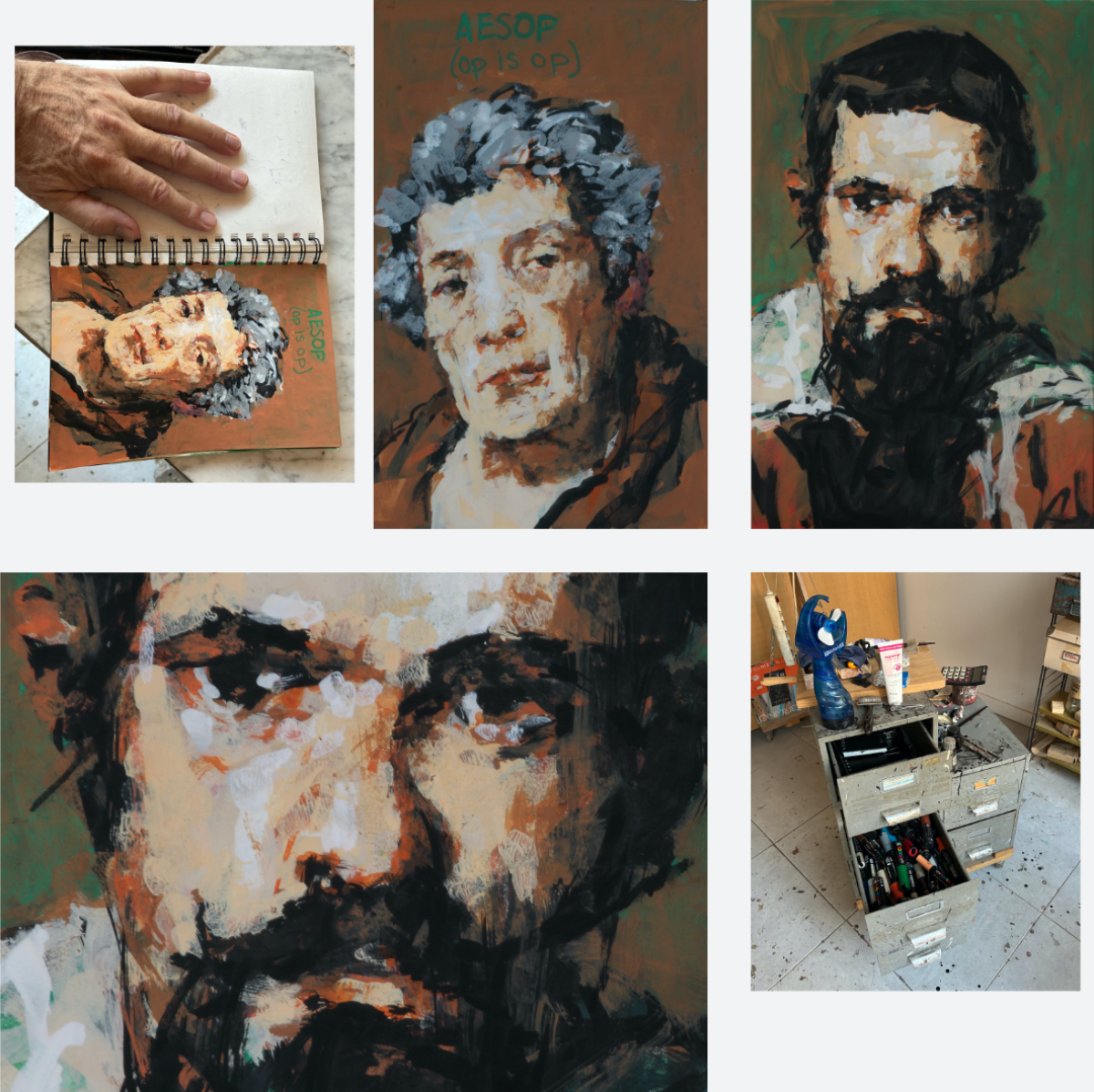
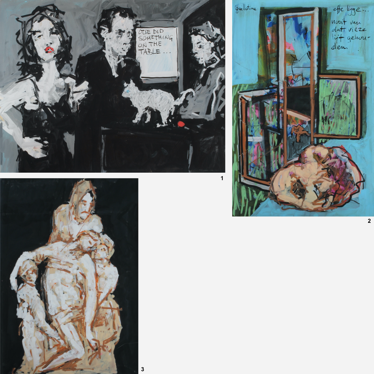
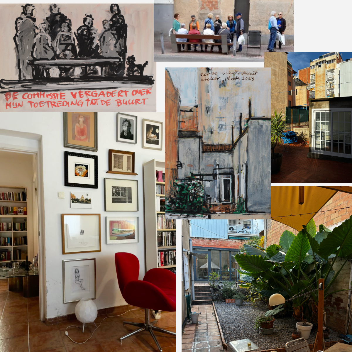
At the same time, I felt the need to adopt a lighter approach; to view everything from a safer distance and through a different lens. In other words, I felt I needed to let loose in my sketchbooks again.
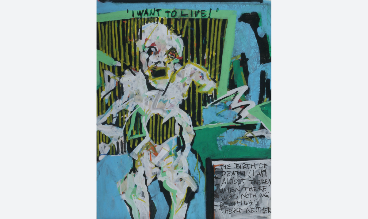
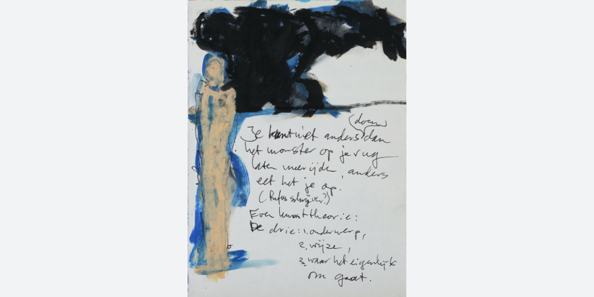
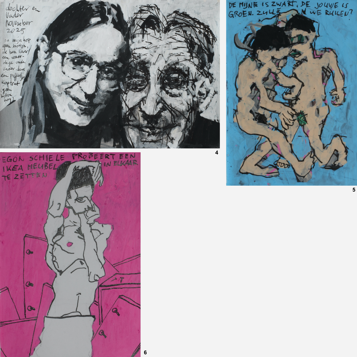
My imagination played with the theme of 'life and death' (in the sketch above, I depict Death being born without a heart; Death that longs to 'live'; though, of course, before the Beginning of the All, there was nothing; and therefore, no death either...). Here are a few more.
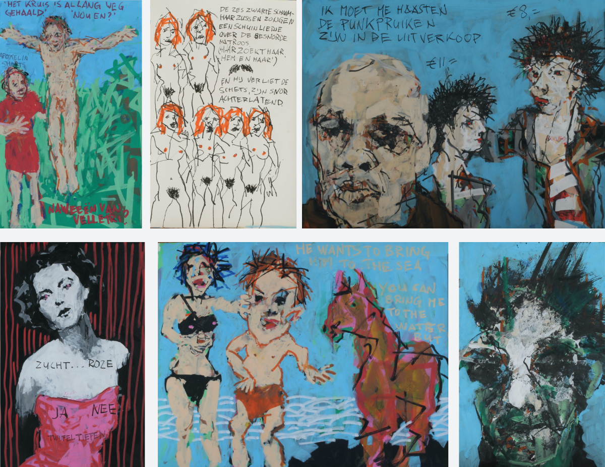
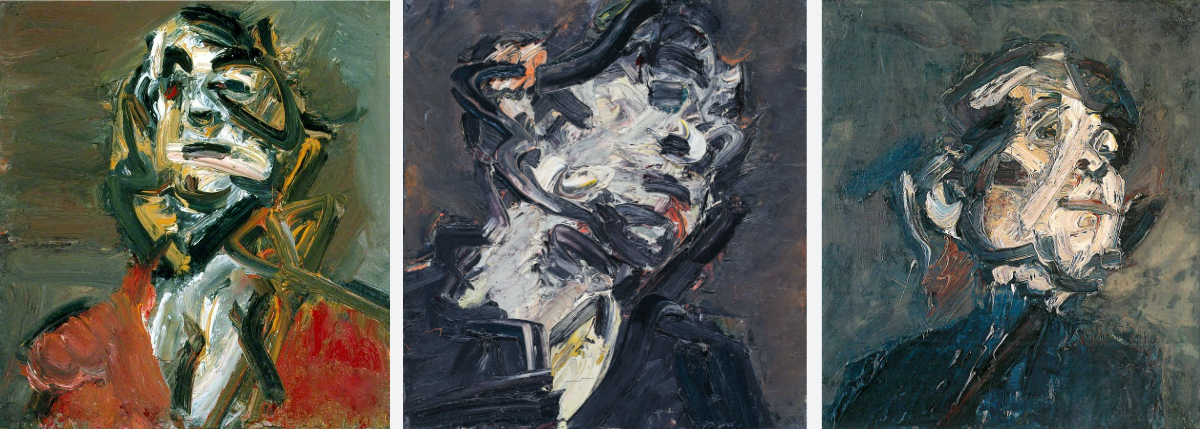
I couldn't resist making two sketches based on portraits by Velazquez. I never cease to marvel at (or rather, admire) the dignity and intensity he imbued his subjects with.

Sitting in the hammock, the music of Lucio Dalla, Mia Martini, Renato Zero, and Gino Paoli compels me to feel serene. 'Questa musica mi rende felice'. I am still alive.
June 30, 2026.
I still conduct my tours as a form of therapy: entertaining tourists with tall tales about how beautiful and extraordinary this city is. Tall tales, because even when you try to get as close to the truth as possible, history is always recounted with the storyteller’s specific agenda in mind, and all too often, that agenda is a twisted lie. I try to paint a lovely picture; one that doesn't stray too far from reality without being overly embellished, while keeping the audience entertained. That is what matters most, in the end.
I limit these tours to twice a week; otherwise, it turns into an endless stream of drivel. After all, people almost always want to hear the same things (usually the clichés about the city, its customs, and its famous buildings). There is little room for digressions or genuine conversation. And playing the entertainer more than twice a week starts to feel painful. The tours keep me modest and humble, which I view as a positive thing. I cycle for three hours (good for my body), I meet people from vastly different walks of life (and sometimes I even make friends!), and I get paid a reasonably decent wage for it, too (a far cry from my lean years in the past). Gerard Reve (a famous Dutch writer of the fifties and sixties of the last century, known for his extravagant and somewhat surrealistic, controversial and crazy way of looking at life. I am rereading one of his novels, so he that is why I quote him) would say: " I think this life is wonderful. And then, later on, eternal life in Heaven. You sometimes ask yourself: 'What did we do to deserve this?' "
July 5, 2026.
Back to my new FLOWER canvas... I lose myself trying to measure up to the beauty around me, knowing I fall short. Then again, can one weep carefully or sensually (even if out of happiness)? Can one rival the beauty of nature? In this painting, I’ve tried to really dial up the contrasts.
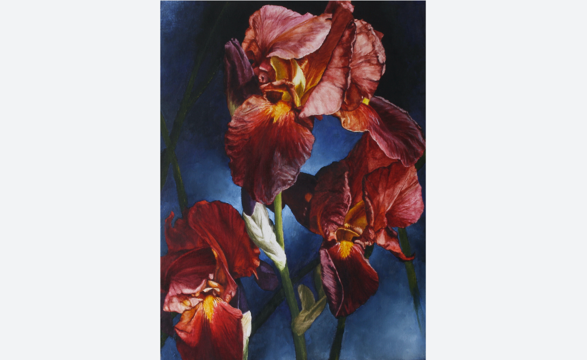
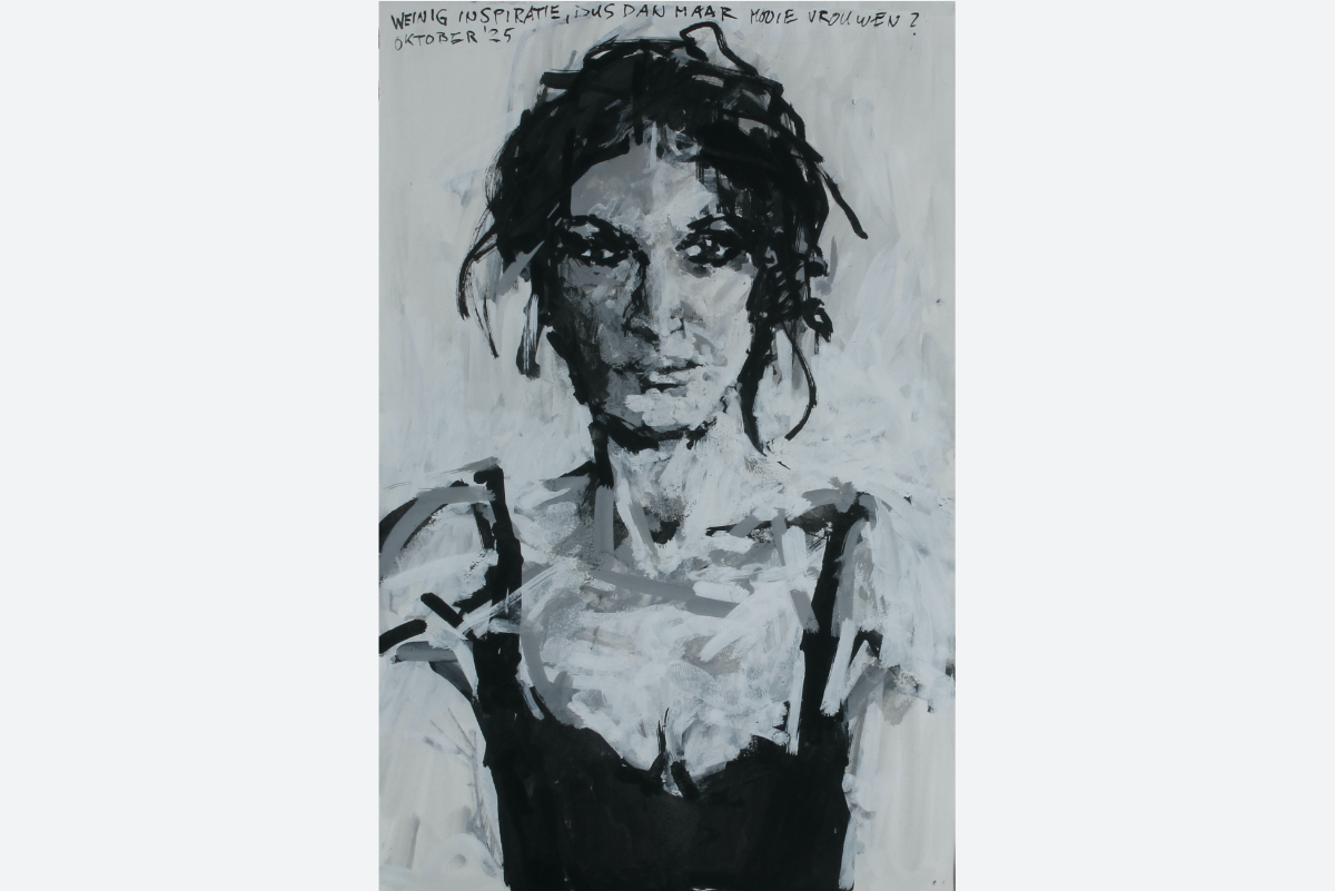
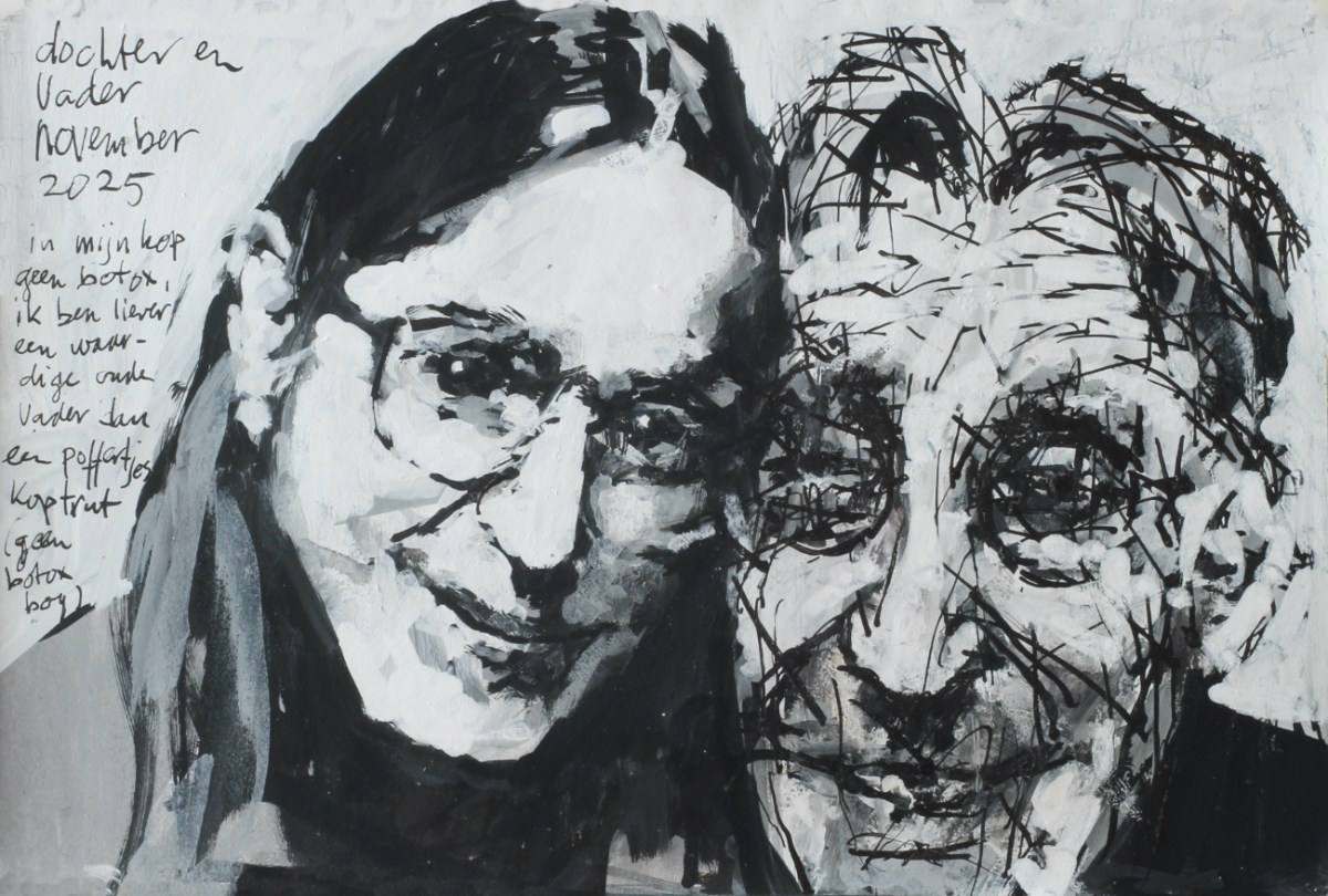
Click the image to view FLOWER 071 on the site. Right, now I’m off to celebrate my birthday with my daughter. She’s invited me to dinner at our favorite Italian restaurant. Below is a sketch of the two of us. Reflecting my resolve never to pump my face full of Botox. I have no desire to look like a puffy, bloated daddy.
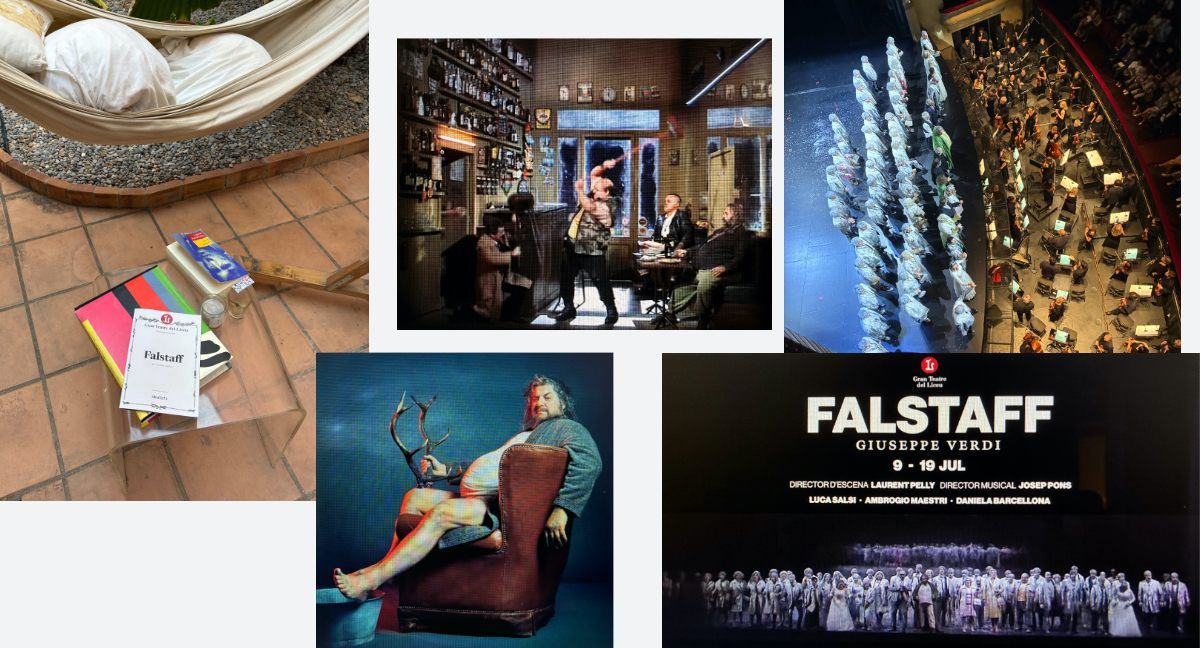
The celebratory dinner was on July 7th. That evening, she invited me to the opera on the 9th.
The opera was Verdi’s 'Falstaff'. I had never even listened to it before, once I had found out it was a comic opera. Generally, I feel that at least one person ought to die in an opera, that it should be a drama. I was afraid it might be something like an operetta... So, I had never bothered to listen to 'Falstaff'. Big mistake!
It is Verdi’s final opera and certainly well worth seeing.
Congratulations to the orchestra, the singers, the performance, and the set design... Go see the opera!
I’ve reached the age where my daughter is the one educating me. I hardly ever leave the house, and I rarely look around me unless it involves paintings... thank you for all the wonderful things, Gala!
And like that, I’m another year closer to shake the icy cold hand of the Grim Reaper! To keep myself entertained, I’m working on a blog post about the 'Chez Matisse' exhibition at the CaixaForum. I just can't help myself...
Like everybody at the end of Falstaff sings:
'Tutto nel mondo è burla!'