13-10-2024: MORNING GLORY, A LOST LOVE
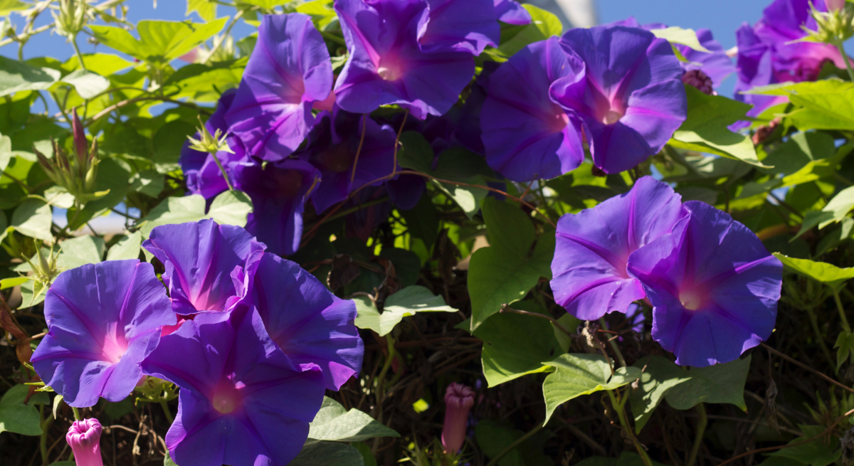
Morning glory, the flowers.
I painted many Moring Glory flowers, fascinated by the colors and the light in the heart of the flower.
Not long ago I discovered that the flower stands for the mortality of love or/and unfulfilled love.
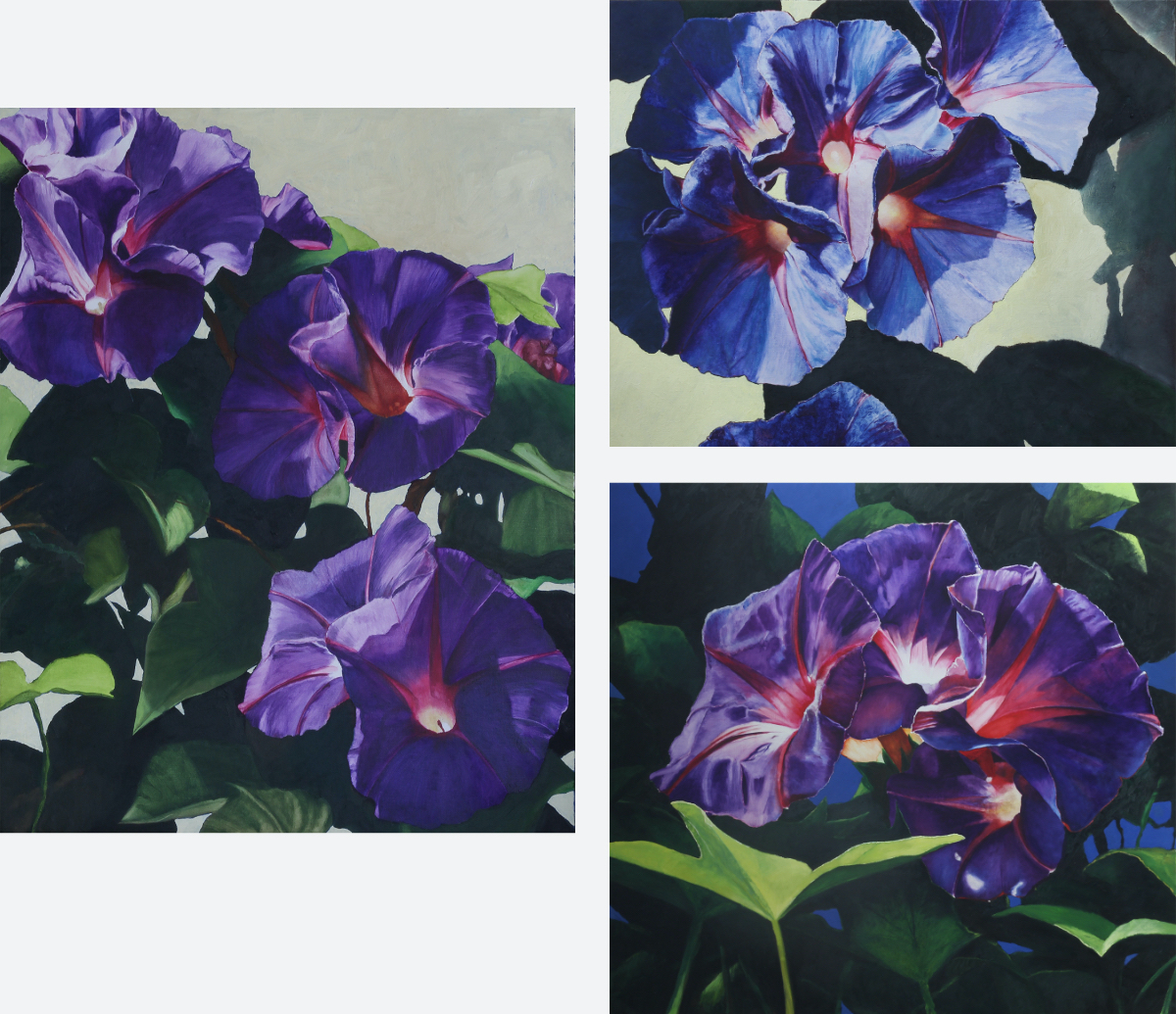
There is a canvas that I have been fiddling around with for ages, changed I don’t know how many times. What to do with this woman? And now I may have finally broken through a barrier. The flowers!
Often I said that I want to paint in a way that resembles throwing an elephant through a keyhole. Flying endlessly out of control and then try to pick up the crazy pieces and make the whole thing function without losing the strong emotion.
The important thing is to go over the edges, not to go for the obvious. In this painting I hope the expressionistic way of painting (and scratching it with a knife) helps to transmit the message clearly.
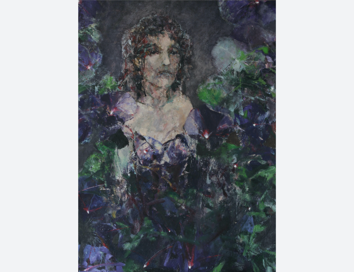
The flowers intertwine with the lady.
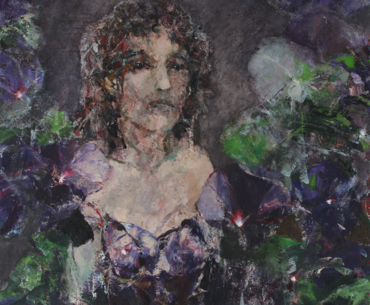
detail
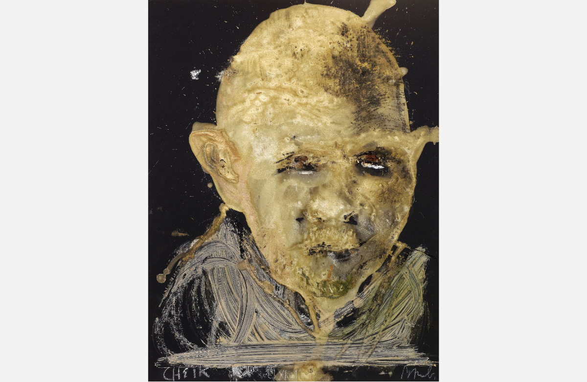
I painted someone who radiates abandonment and speechless sadness, who has turned in on herself because of the lack or loss of love.
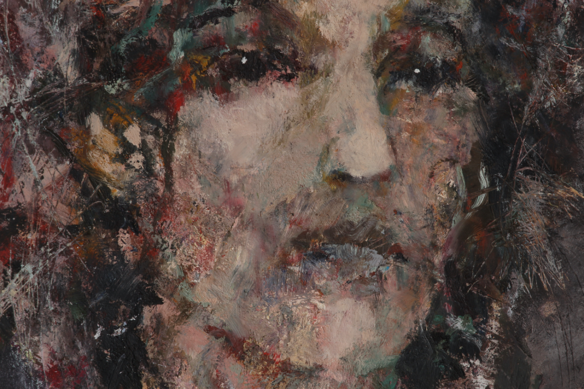
detail of the face
To see the painting on the site, click on the image above.
A painting should have an 'obvious' surprise, something that clicks in in a painterly way. Here I found it in... can you spot it?
Lately I have been suffering a lot from a rhythm and blues mood.
The youtube video may show the opposite emotion of what the woman expresses but certainly feels within.
SHATTERED…
The music helped/guided while painting. Fasten your seatbelts!
18-08-2024: SOME SKETCHES AFTER TWO GREAT MASTERS
At least three times I made a sketch after Velazquez’ portrait of Juan Pareja. One ended up on the shelve somewhere in the Netherlands. I don’t have the image.
The portrait of Juan Pareja and the portrait of the pope Innocenzio X are amongst my most favorite portraits.
What I love so much about all of Velazquez’ portraits is the dignity he gives the portrayed, the respect he shows (even though the pope scared the hell out of me the first time I saw the painting. The portrait hangs in a little room aside and when I entered it, the way he looked at me made me escape the room twice before I had the courage to confront me with the painting).
These sketches I made in the past. The second one of Juan Pareja not so long ago.
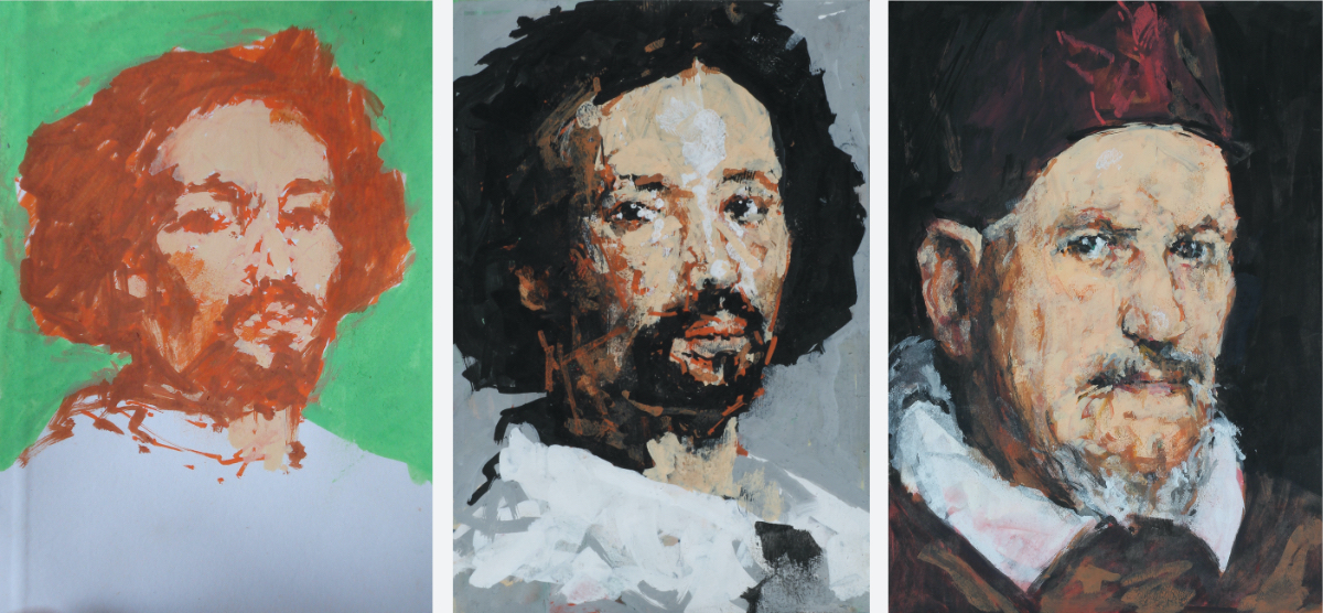
sizes: 15 x 10 and 20,5 x 14,7 cm.
Time to again play with some of my favorites: Velazquez and Goya. Exercises, trying to discover where the magic lays. All but one are portraits.
I sketched Philip III on a horse against a blue sky (by Velazquez), maybe because a friend of mine owns a horse now? Just for fun. Not really a serious sketch…
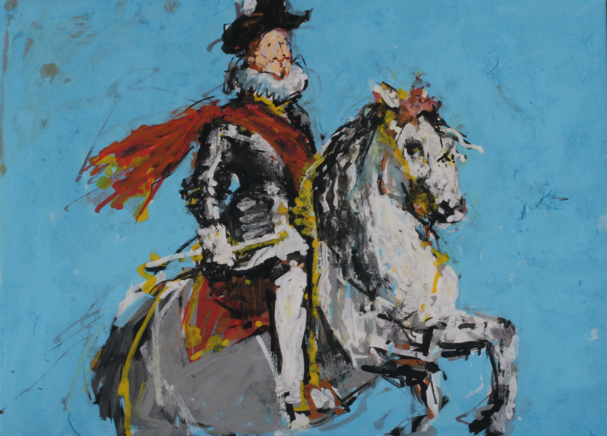
size 14,7 x 20,5 cm.
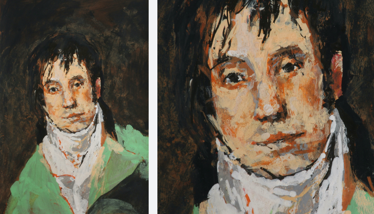
Of Velazquez I chose this portrait of a man (José Nieto?) to draw. Quite often when I work on a portrait commission, I look at this one to get inspired.
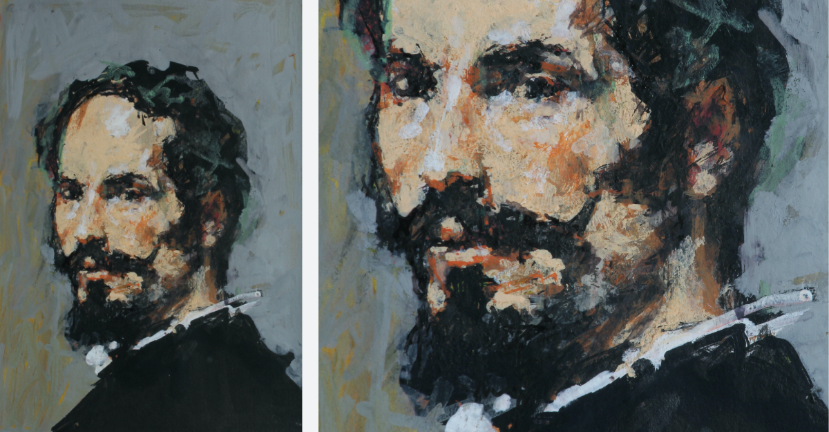
size 15 x 10 cm.
And then there are these portraits of Goya. The first one I have reworked, made better.
size 15 x 10 cm.
Below is the sketch after Goya's Isabel de Parcel. I have always found that it leans too much over to just the browns and blacks. Was he a bit in love with her, distracted by her beauty? Is it not a bit too much just a pretty woman with amazing big eyes?
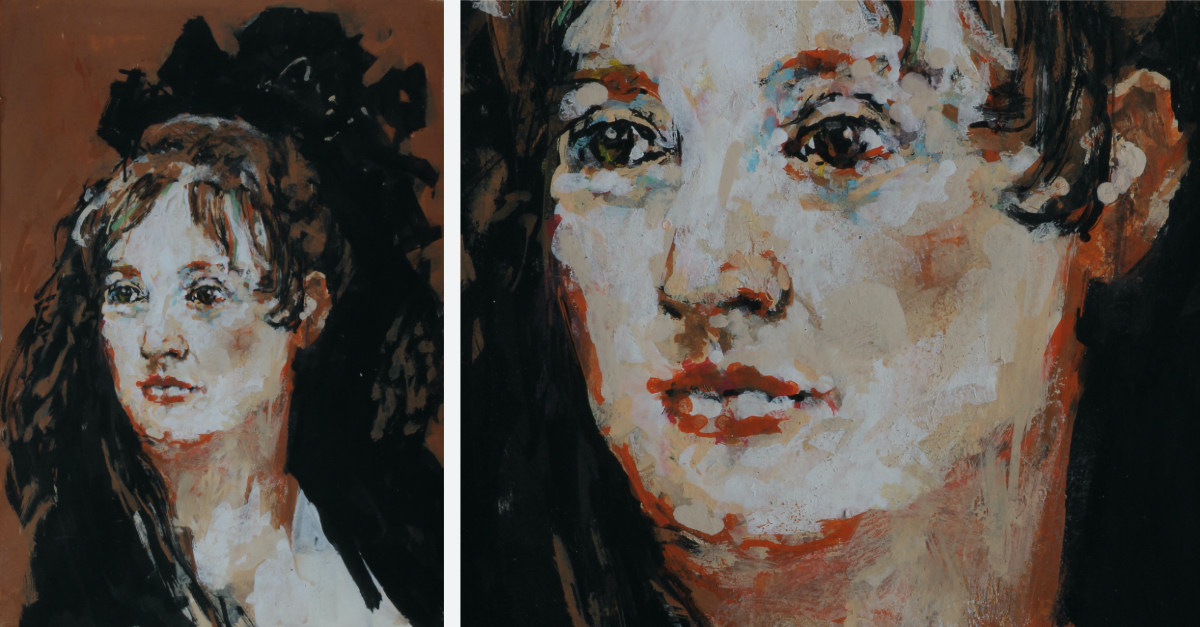
size 20,5 x 14,7 cm.
Technique used: Posca Markers and pen and ink. In the limitation (you cannot mix colors) is the fun of playing. I can never get to making an exact copy not only because of the used markers, the interpretation shows my identity. I hope the portrait is recognizable the same, I go for that, but to get under the skin of Velazquez or Goya is impossible.
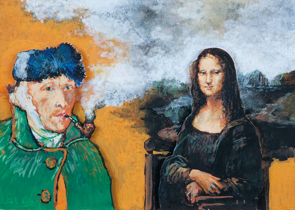
Making sketches after my heroes' great works resulted in my series ‘ART HYSTERIA’. I combined different parts of paintings. The technique used for the different 'victims' was Posca Markers that unified the sometimes very different styles of the paintings quoted.
Click on the image to go to the series on the site.
But that is years ago… It didn’t get to making a book of them… a pity...
The song that accompanies this blog?
Mad Dogs and Englishmen in 1970! Almost antique, not as old as the paintings interpreted but almost.
One of my all time favorite songs. A thing I love is the chaotic atmosphere, there were three drummers for example. This series of concerts by the Mad Dogs and Englishmen was the epitome of freedom, debauchery and positivity.
What I try with my Posca Markers is to get off track, to not be too exact not ‘to draw within the lines’ but to get the feeling of everything goes. First to go loose and then to pinpoint it down. To show life, happiness. 'The Letter' helps.
And this too is an interpretation of the song by the Box Tops.
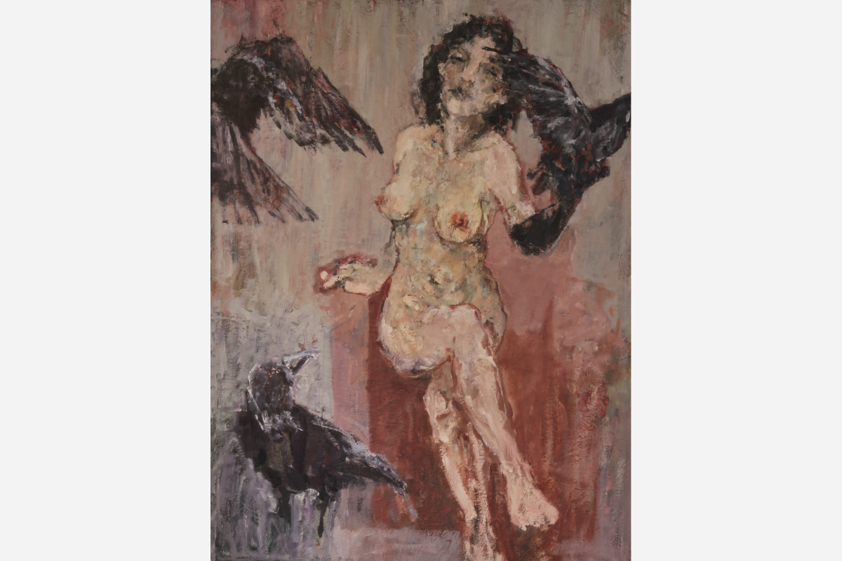
11-08-2024: LENORE, THE THE MADONNA OF THE RAVENS
I am preparing all for the commission for the new church in Italy. Because of the holidays everything is closed. I cannot calculate all the costs, so I have ‘spare time’.
Apart from flowers and bulls I thought, ‘why not make a sexy nude?’. The thought came up because of the images in catholic churches, the question of physical beauty and seduction.
In all the religious images there are some ‘rules’ that have never been violated. Even if Caravaggio came very close. But here I don’t talk of a prostitute as model for Mary.
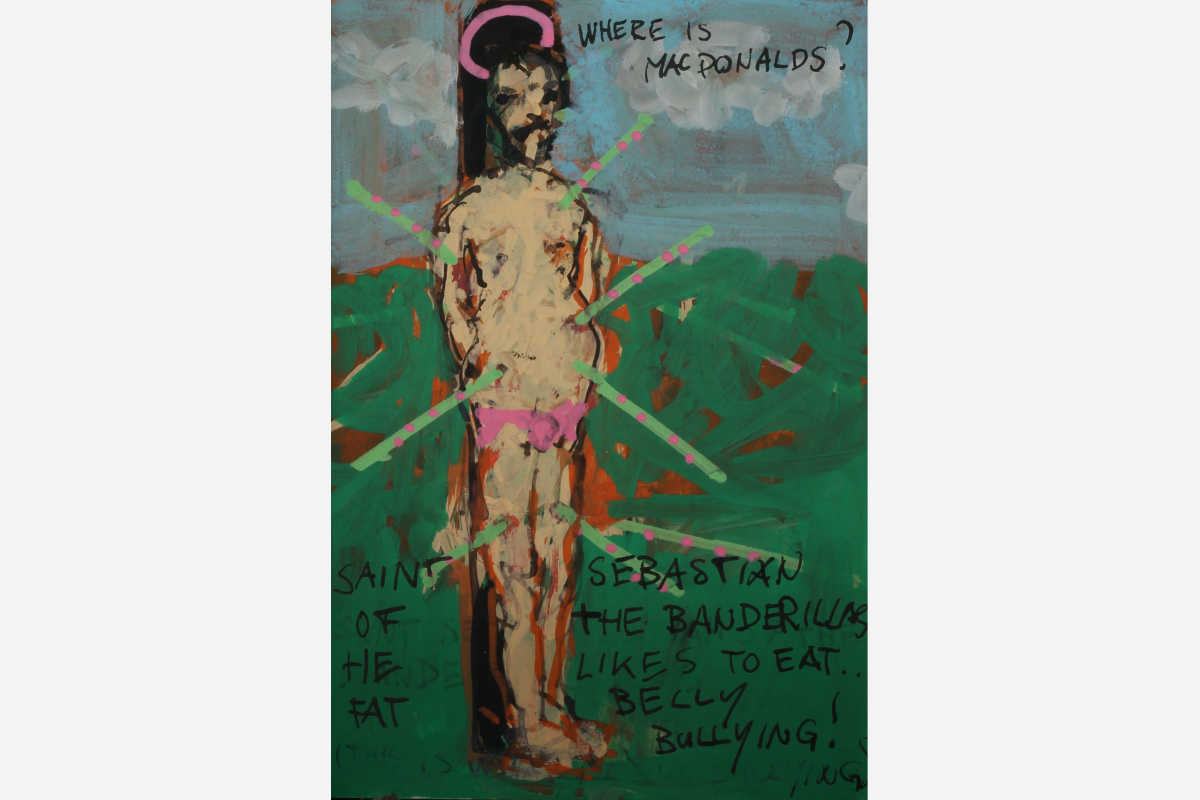
I talk about the appearances. Recently I made this little sketch of Saint Sebastian with a big belly. My Sebastian just likes Mac Donalds' BIG MAC…
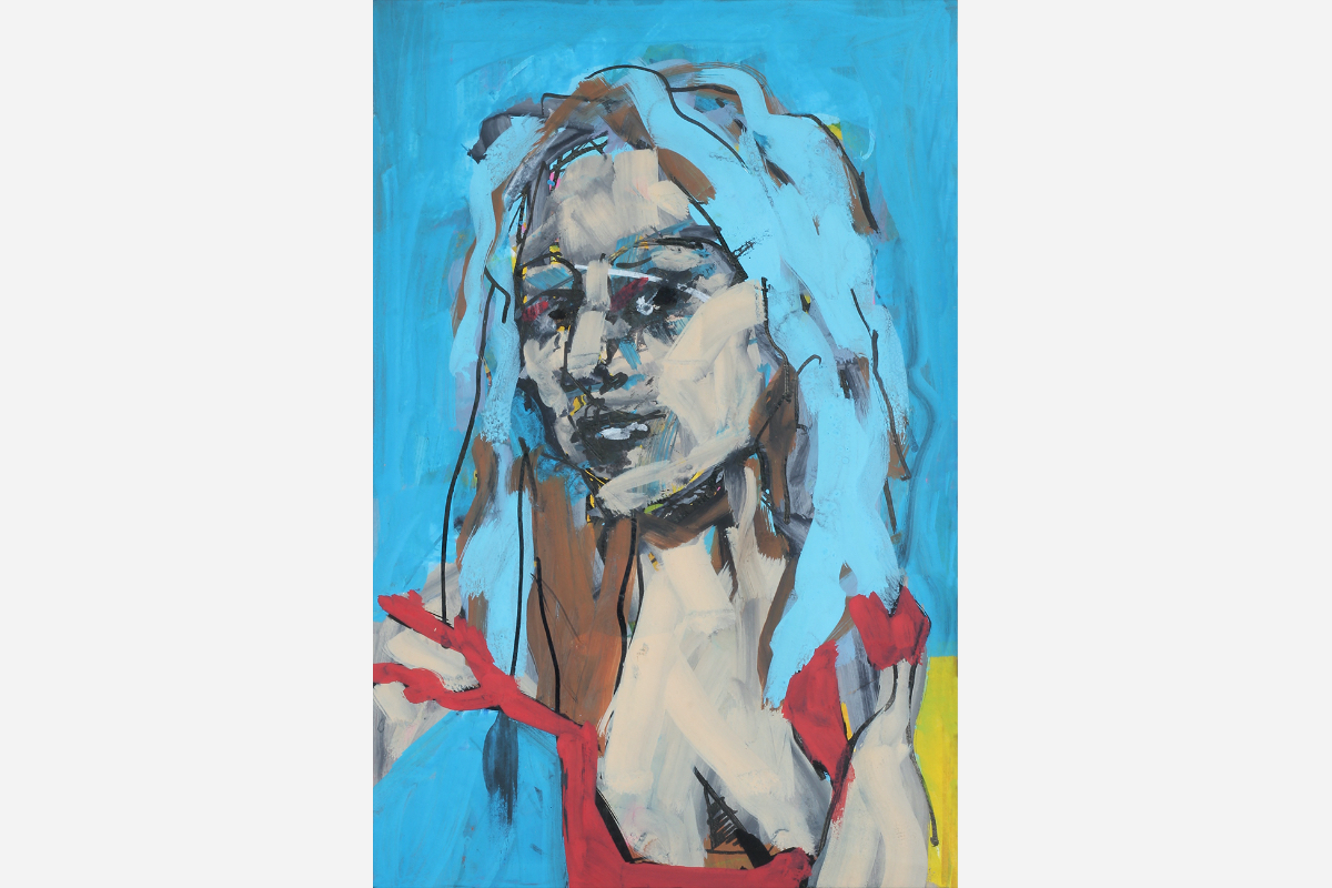
And what if Jesus had a hairy chest and o'legs? Time ago I made this little sketch of ‘sexy’ Mary. Even Gala was a bit surprised.
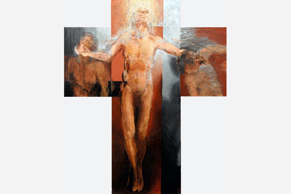
For the crucifix in Modena I used as a model an ex dancer, a guy with the dreamlike physical…
Back to the new painting. In 1990 I made a sensual female nude that didn’t even make it to the show I had in a gallery. I sold it before. A naughty and independent girl. She didn’t feel like hanging on a wall in a gallery…
The thought of repeating this painting has travelled with me over the years. To try to make another seductive ‘goddess’.
Now I had the time.
First the goddess went sort of ok, but then I got bored. To repeat a painting always leads to a lesser version of the original one.
I searched for depth and then the poem of Edgar Allen Poe, ‘THE RAVEN’ presented itself.
I am fascinated by these very intelligent birds. There is something devilish about them. It is this contrast that gives the painting the meaning and tension.
About in which direction I wanted to go concerning how to manipulate where the viewer concentrates on... How far to push suggestion, not defining too much here and there.
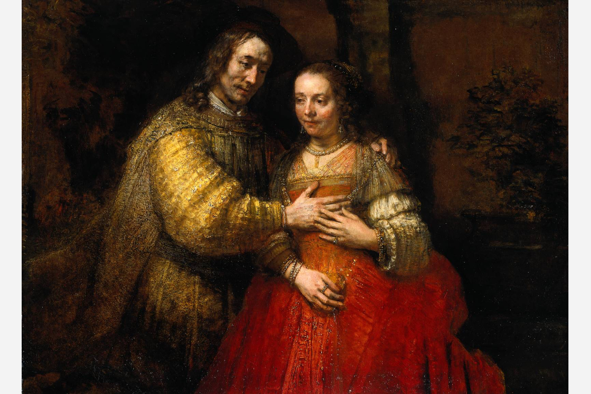
It goes back to the Italian years (1980-83). Mikulas told me that he was interested in the plant in the background of the ‘Jewish Bride’ of Rembrandt. It is there but it is not treated in the same way as the two people.
The importance given the secondary subject not as outspoken as the main players is the piece.
And I searched for a color scheme not often used: grey/greenish and pink/red brownish. I wanted to play with the skin color and the opposite, grey/greenish. There is more: the here and there subtle reddish outlining that makes her stand out more.
She didn’t turn out as challenging as ‘THE VAMP’, but I can live with this mysterious goddess.
Here she is.
Click on the image to go to the site.
19-07-2024: FIESTA 03 (English, for the Dutch text go to the blog below)
Not long ago I celebrated my birthday, a birthday that neither of my parents ever celebrated. I survived them both and that makes me think. This gives all a different twist.
Forty-four years ago I graduated from art school. Since then I have been on my quest in the visual arts. I suspect that I am in my final phase or at least well past the halfway mark. I'm still learning; I continue my bumbling, searching footsteps in terra incognita cautiously, increasingly cautiously. How much time do I have left? How to tackle it?
Recently I read a biography of Picasso and towards the end he kept painting more desperate, gave himself less and less time to give a canvas a rounded appearance. With the death on the heels, he bugled one canvas after another. I have always thought that he wanted to trample everything, grind all down. His painting had not so much to do with love, it had to do with enchanting and overpowering.
At the end of his life he must have felt hopelessly lonely (he treated the people around him in the same way). He must have been aware that the magic remedy, painting, could not provide salvation. No matter how hard he struggled.
That's how I remember Peter Defesche's last exhibition. A painter stuck in the idiom of the fifties to the seventies, in short, producing a creative so called innocent mess. He also felt the end was approaching and had produced an enormous amount of worn-out junk.
There is no hold. Just before death takes you, to overwhelm people with your latest statements. Quantity is not quality, nor does it bring salvation.
What is my strategy? I also know that I have less time left than the past forty-four professional years.
I have no fear of death and know that I will never be able to paint the absolute picture. You don't produce the ultimate act, the ultimate gesture, it overcomes you. Death is the ultimate event.
But to work in a higher gear, at a suffocating pace, to fill the canvases one after another...
Hopefully to realize that CANVAS, to meet absolute truth and absolute usefulness in art in that desperate way... I doubt and doubt more than before.
Art serves no purpose. At least, there is no proof. And that is also reassuring.

In FIESTA 03 I tried to work towards a conclusion to which I cannot add anything now. I painted it looking at 'my GREAT EXAMPLES' and at my own older works that still seem to me as close to my absolute painting.
You must try to surpass your gods and yourself. That's what you have to do. An impossible task.
I look at the great masters and look and look. Quite recently I also see more of their weak sides, those where for me they do not correspond to total perfection. It may sound arrogant, but it is the task of all artists to reach further after climbing on the shoulders of their masters.
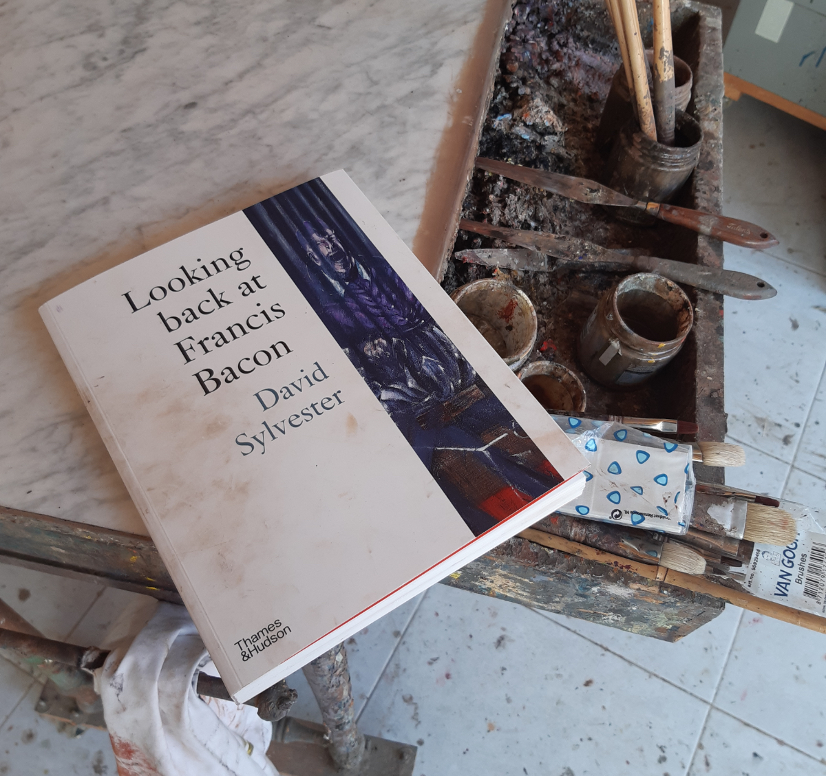
I recently purchased another book about Francis Bacon. His work is in the same environment that I find myself in with FIESTA 03. And then I wonder where I don't accept his solutions, where he goes wrong or banal for me.
Only then can you create something that really has a soul, your own soul that kindles like a flame in the dark.
I'm not in a hurry. I wish that everything I present shows me the strongest possible credibility. Festina lente!
What is the essence of painting. What should we talk about… Of course the themes are death, fear, seduction, sensuality, love and survival. I try to present it as inevitably as possible in a painterly context that cannot be explained verbally. In a style that is not too time-bound.
We are all trapped in our time with its beliefs. For me, contemporary art means art that conveys a strong emotion to the viewer today. Even if it was made five centuries ago and perhaps with different intentions. That is why my great role models have not only walked the earth for the last hundred years.
A change from realistic representation must have a strong reason, not come from ignorance or too much linked to the spirit of the times. I agree with Arthur Danto, who stated that we live in post-historic times. There is no more progress to be found in a so-called new style. Nothing needs to be demolished anymore. Everything has been done, what remains is to work in a way that convinces/surprises yourself. Of course, there is always a personal twist and that twist is maximized when you go to your extreme.

FIESTA 03, if you click on the image you go to the painting on the site.
While time is running out, I take the time to purify my paintings of everything that I consider unnecessary. Enough babbling! Each painting must be the final chord until I begin the next.
detail of FIESTA 03
One final thought. One of my best friends, one who owned several of my works, asked me just before his passing away what the meaning behind a large canvas (that he owned) actually was. I owed him the answer...
18-07-2024: FIESTA 03 (Nederlands)
Niet lang geleden heb mijn verjaardag gevierd, een verjaardag die mijn beide ouders nooit gevierd hebben. Ik heb ze beiden overleefd en dat geeft me te denken. Alles heeft een andere lading.
Vierenveertig jaar geleden studeerde ik af aan de kunst academie. Sindsdien heb ik mijn zoektocht in de beeldende kunsten voorgezet. Inmiddels bekruipt mij het vermoeden dat ik mij in een eindfase bevind of in ieder geval ver over de helft. Ik leer nog steeds; ik vervolg mijn stuntelende, zoekende voetstappen in terra incognita behoedzaam, steeds behoedzamer. Hoeveel tijd heb ik nog? Hoe het aan te pakken?
Ik heb pas een biografie over Picasso gelezen en hij schilderde naar het einde toe steeds wanhopiger, gaf zich steeds minder tijd om een doek een afgerond aanzien te geven. Werkelijk met de dood op de hielen raffelde hij het ene na het andere doek af. Nu heb ik altijd al gevonden dat hij alles wilde vertrappen, vermalen, van zich af gooien. Zijn schilderen had niet zo zeer te maken met liefde, het had te maken met bezweren en overmeesteren. Hij moet zich op het einde van zijn leven verlaten, hopeloos eenzaam hebben gevoeld (ook de mensen om hem heen behandelde hij op een zelfde wijze). En hij moet zich bewust zijn geweest dat het tovermiddel, schilderen, geen verlossing geven kon. Hoe hard hij ook door ploeterde.
Zo herinner ik mij ook de laatste tentoonstelling van Peter Defesche. Sowieso een schilder vastzittend in het idioom van de vijftiger tot zeventiger jaren, kortom creatief semi onschuldig geklieder, die ook het einde naderen voelde en een enorme hoeveelheid aan afgeraffelde zooi had geproduceerd.
Er bestaat geen houvast. Nog even voor de dood je halen komt de mensen overstelpen met je laatste statements... Kwantiteit is geen kwaliteit, noch brengt het verlossing.
Wat is mijn strategie? Ook ik weet dat mij minder tijd rest dan de afgelopen vierenveertig professionele jaren.
Ik heb geen angst voor de dood en weet dat ik het absolute schilderij nooit zal kunnen schilderen. De ultieme daad, het ultieme gebaar maak je niet, het overkomt je. De dood is de ultieme gebeurtenis. Maar om nu in een hogere versnelling, in een verstikkende vaart nog doeken vol te smeren om misschien toch dat doek te realiseren, om in de kunst de absolute waarheid en het absolute nut op die wanhopige manier te ontmoeten… Ik twijfel en twijfel meer dan voorheen.
Kunst dient nergens toe. Althans, er is geen bewijs te leveren. En ook dat is een geruststelling.
In FIESTA 03 heb ik gepoogd naar een afronding te werken waar ik nu niets aan toe kan voegen. Ik heb dat geschilderd kijkend naar ‘mijn GROTE VOORBEELDEN’ en naar mijn eigen oudere werken die mij nog steeds voorkomen als dichtbij mijn absolute schilderij.

Je probeert je goden en jezelf te overtreffen. Dat is wat je te doen staat. Een onmogelijke taak.
Ik kijk naar de grote meesters en kijk en kijk. Vrij recent zie ik ook meer hun zwakke kanten, die waar ze voor mij niet beantwoorden aan totale perfectie. Het mag arrogant klinken maar het is de taak van alle artiesten om na op de schouders van hun leermeesters te zijn geklommen verder te willen reiken.
Ik heb kort geleden weer een boek over Francis Bacon gekocht. Zijn werk bevindt zich in dezelfde omgeving waarin ik mij met FIESTA 03 bevind. En dan vraag ik mij af waar ik zijn oplossingen niet accepteer, waar hij voor mij mis grijpt, banaal is.

Alleen dan kun je iets maken dat werkelijk een ziel heeft, je eigen ziel die als een vlammetje in het donker wakkert.
Ik heb geen haast. Ik wens dat alles wat ik presenteer mij een zo sterk mogelijke geloofwaardigheid toont. Festina lente!
Wat is de essentie van schilderen. Waar moeten we het over hebben… Natuurlijk zijn de thema’s dood, angst, verleiding, sensualiteit, liefde en overleven. En ik poog die in een schilderkunstig, dus niet woordelijk uitlegbaar verband zo onvermijdelijk mogelijk te presenteren. In een stijl die niet al te tijdgebonden is.
We zitten allen gevangen in onze tijd met zijn overtuigingen.
Voor mij betekent hedendaagse kunst kunst die heden ten dage een sterke emotie overbrengt aan de toeschouwer. Ook al is die vijf eeuwen geleden gemaakt en wellicht met andere intenties. Vandaar dat mijn grote voorbeelden niet alleen de laatste honderd jaar op de aarde hebben rondgelopen.
Een ombuiging van realistisch weergeven moet een sterke reden hebben, niet ontstaan uit onmacht of te aan tijd gebonden mode. Ik ben het eens met Arthur Danto, die stelde dat we in de posthistorische tijd leven. Er is geen vooruitgang meer in een zogenaamde nieuwe stijl te vinden. Niets hoeft meer te worden afgebroken. Alles is gedaan, wat er rest is te werken op een manier die jezelf overtuigt en verrast. Er zit natuurlijk altijd een persoonlijke draai aan en die draai wordt maximaal als je tot het uiterste gaat.
FIESTA 03 (klik op de afbeelding om naar het schilderij op de site te gaan)
Terwijl de tijd dringt neem ik de tijd om mijn schilderijen te zuiveren van al wat in mijn ogen niet onvermijdelijk is. Genoeg geleuterd! Elk schilderij moet het slotakkoord zijn tot ik het volgende begin.

detail van FIESTA 03.
Nog een laatste gedachte. Een van mijn beste vrienden en een die verschillende werken van mij bezat, vroeg mij vlak voor zijn overlijden wat de bedoeling achter een groot doek (dat hij bezat) nu eigenlijk was.
Ik moest hem het antwoord schuldig blijven...
24-04-2024: 4 BULLS IN THE LIGHT
In late 2023 and early 2024 I made four BULL paintings. The theme still fascinates me. As a fan of Rembrandt and Caravaggio amongst the many other geniuses I introduced light as an important factor.
In the paintings of Caravaggio light was a very important means to direct the viewer’s attention to what mattered and to give the subject direction for the first time. Dramatic light gives a painting a special twist.
Bulls are animals that do well with such a twist. Snails don’t…
I made a video of the four and looked very long for what music to accompany it. I didn’t find it… It reminds me of the several times I saw the ballet on the music 'Le sacre du printemps' by Igor Stravinsky. The ballet never lived up to the music (here it is the other way round?). There is so much violence, anger...
So here it is, let’s call it my dramatic silent MOVIE OF BULLS IN MOTION.
Click on the image to go to the video.
Enjoy!
As the additional music video I put 'Hey Lord. Don't ask me questions' by Graham Parker and the Rumour. It was a hit in 1976. The style was pub rock. These years were the times of punk, anger, no future. And this mood, I find, if channeled in the right way can be very productive. The same one can feel when seeing a bull charge.
Barcelona, April 24, 2024
29-02-2024: THINKING BIG AND THE NEW GENERATION
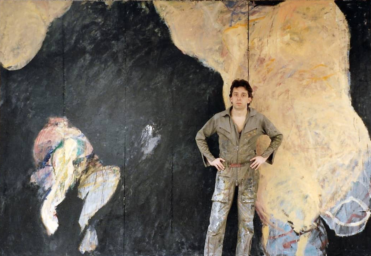
I wanted to send a dear friend a photo of a work I made long ago. I had the slide digitalized and I thought, why not have one made of a big slide of my ‘DISTURBING YELLOW’, a 200 X 300 cm diptych made in 1990…
It triggered the look back.
I had a nice studio in Amsterdam.
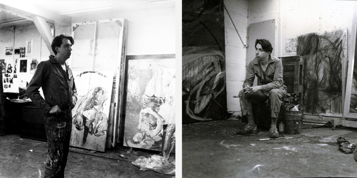
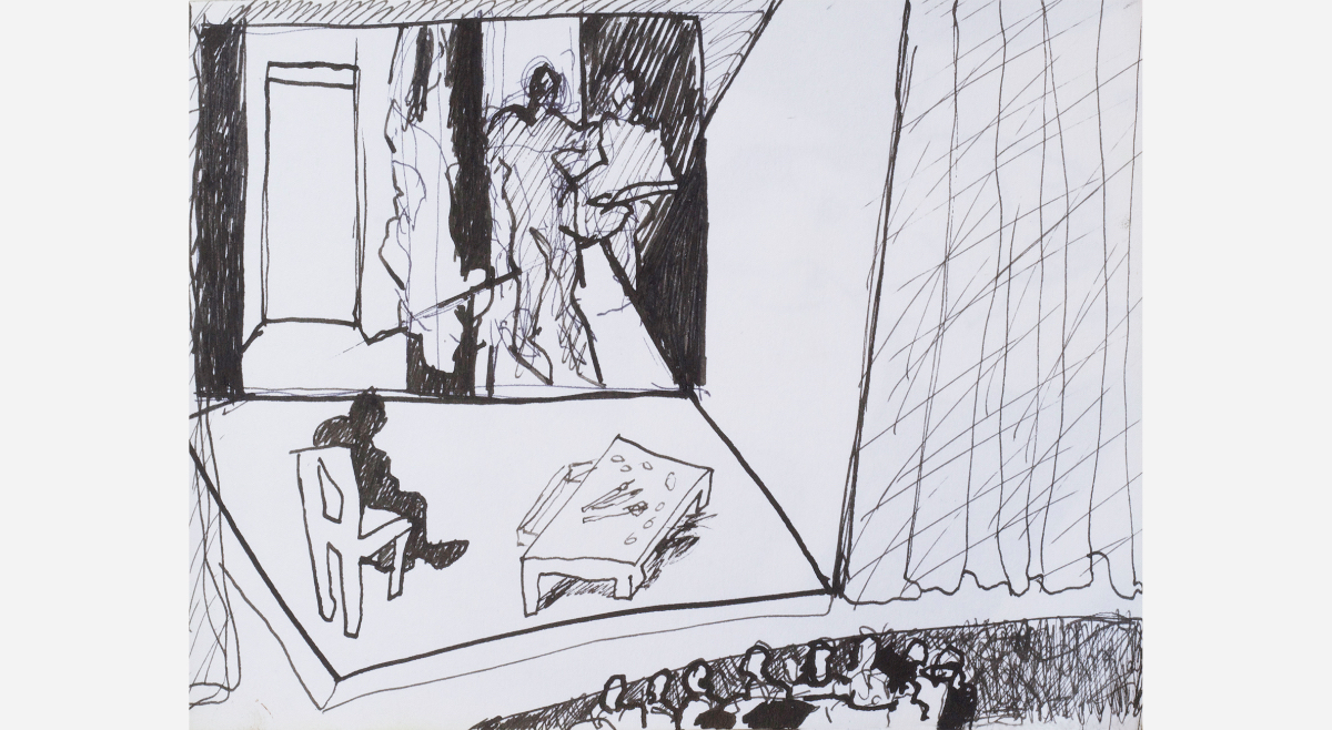
In 1987 I participated in the dance production ‘QUADERNA’. I painted on stage, first the scenery, the back drop during the performance (on the photo left you see them stacked against the wall), I ran up and down the stage, bothered the dancers and in the end I painted them. It is the only theatrical experience I had, it was BIG FUN.

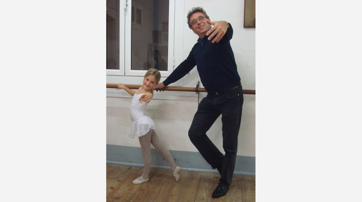
Could I have known that my daughter went to all these ballet classes? So father so daughter? Not really (photo made much later).
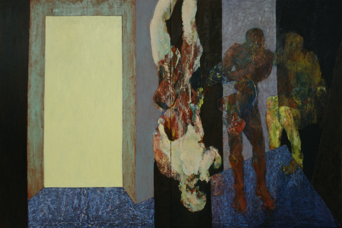
After the performances of 'QUADERNA' I had about 8 or 10 sort of canvasses of 275 high and 125 wide if I remember well. So I thought of BIG STUFF. Twice I made a triptych in 1988. Both ended in private collections in Milan, Italy.
‘BIG FOOT’ (with me in front)
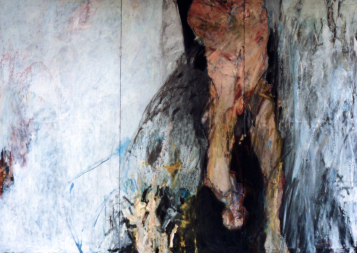
‘TOWARDS THE FIRE’
In 1989 I continued to paint BIG. First was the triptych ‘THE PRAYING MANTIS’.
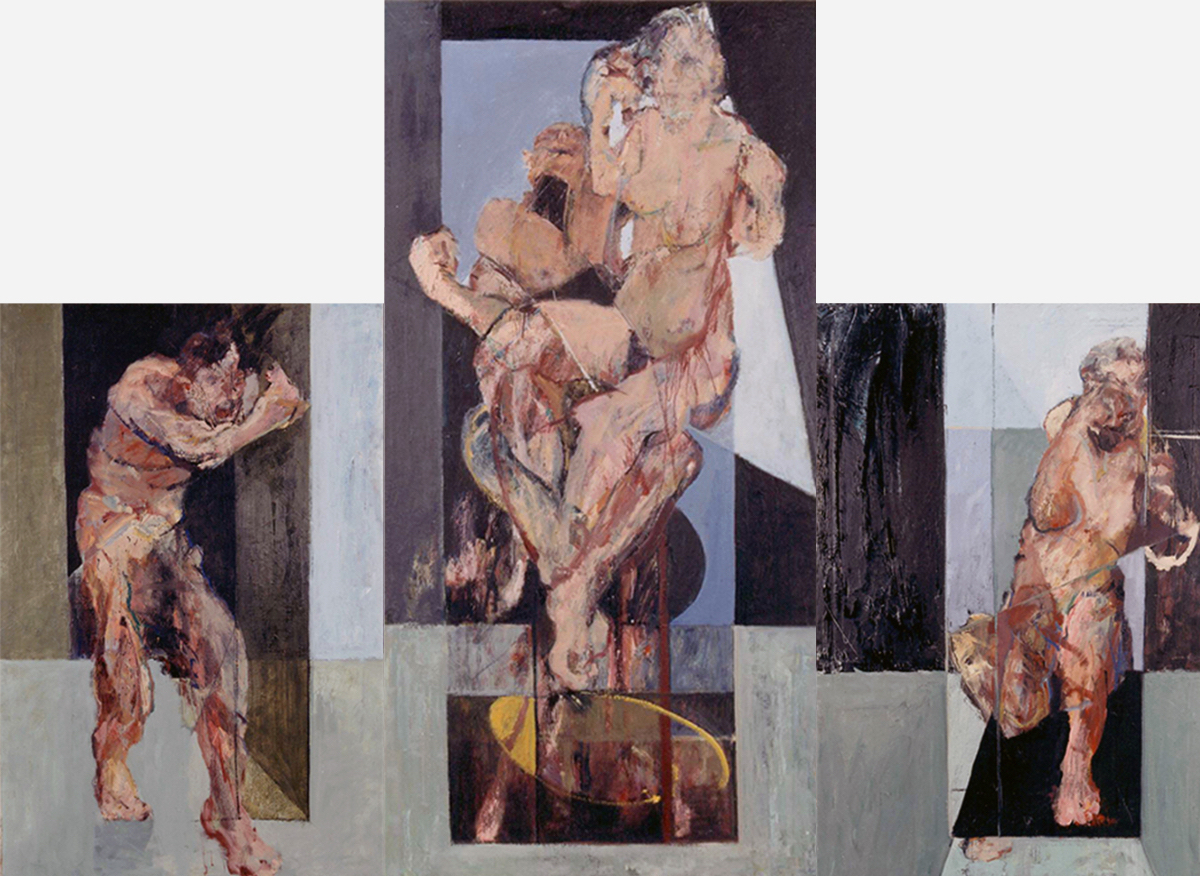
Followed by:
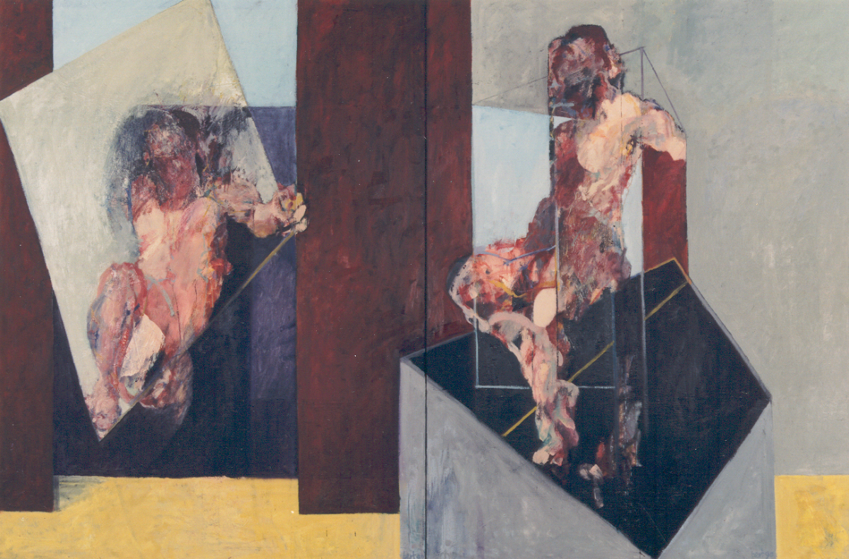
‘THE KITES’
and
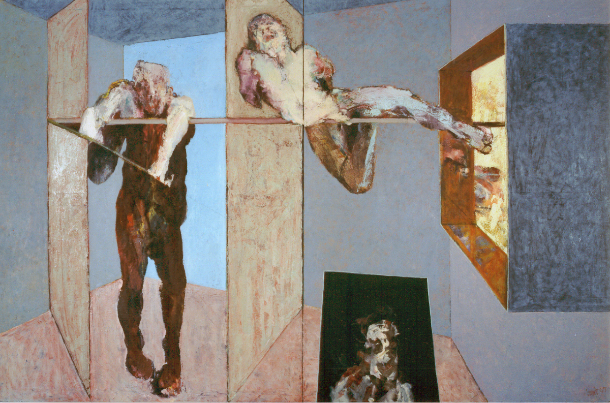
‘THE THREE BROTHERS’
size 200 X 300 cm.
These three paintings were finished around 1990. All were sold during my solo show at Jaski Art Gallery. And then I made 'DISTURBING YELLOW', exposed and sold during my solo show at Gallery Langenberg.
I moved to New York where new adventures awaited me. I made the series ‘MY METROPOLIS’ and got the idea for the ‘FALLEN ANGELS’ amongst others. (Click on the grey words to go to the texts)
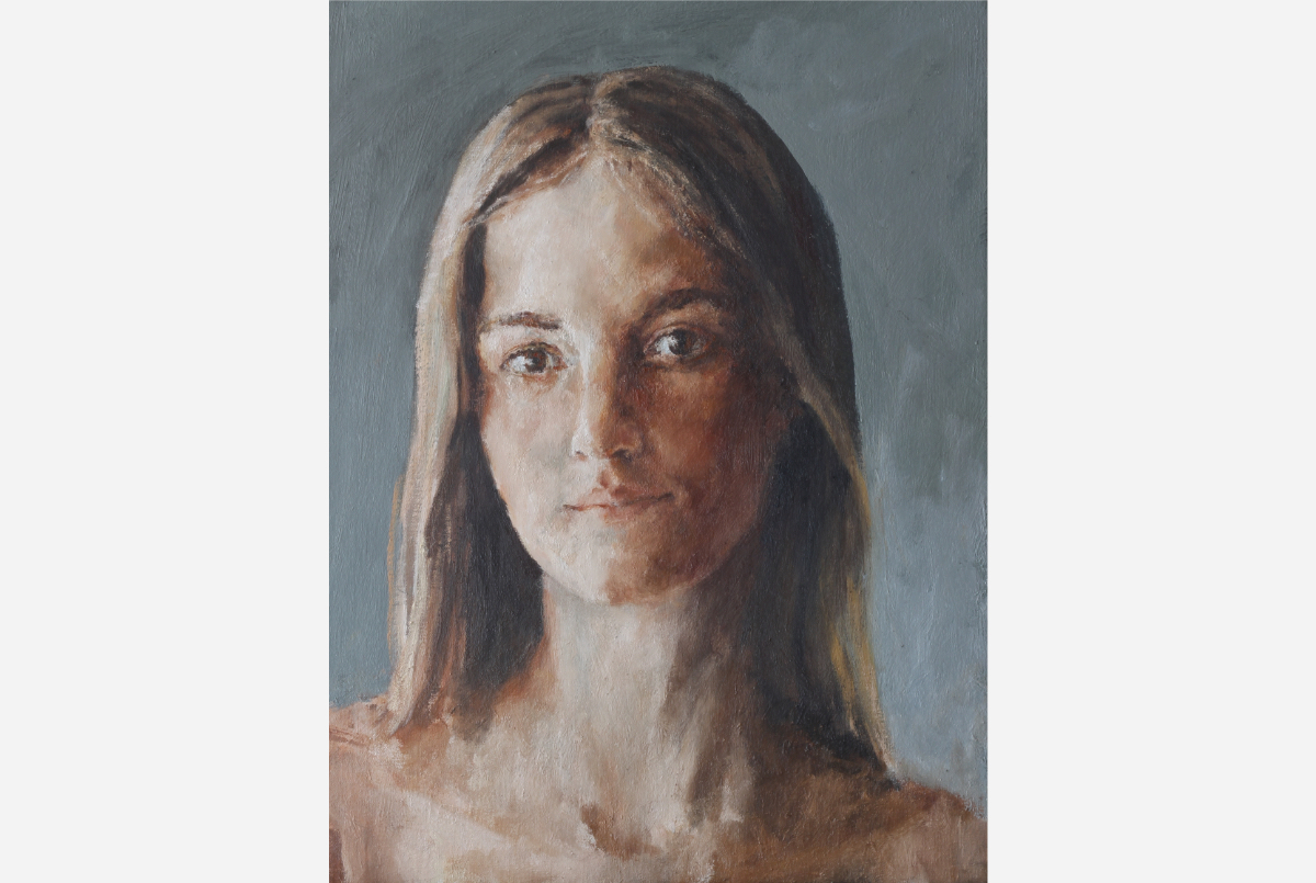
Time passed by. I went back to Amsterdam and ended up in Barcelona where for the last twenty years I have been living (with an interruption). One happy and BIG reason for me to live here is to be near to Gala. I painted her portrait in 2022.
Portraits… Soon I will bring three portraits to clients in London.
A month ago I started a FLOWER painting but found out that my mood looks in another direction: to that same old way of working in the nineties, but a bit smaller in size because my studio doesn’t really allow me to make real BIG STUFF.
Currently I am working on ‘FIESTA 03’. I am letting it jump from one loose thought to the other. Hoping to get in touch with deeper layers of my subconscious. Do I have something to tell? I should have enough craftsmanship to go back and forth from uncontrolled wildness to reason, giving the unexpected its role to play. Art is about controlled chaos.
And now for the BIG SURPRISE:
Here is the new ANGEL of the BIG SCREEN…
The show must go on… with the NEW GENERATION!
(about the chanson: sorry for me being a bit sentimental)
08-02-2024: From Giacometti to how to behave as a GREAT AND FAMOUS ARTIST
In my sketchbooks I experiment, follow unexpected thoughts, play, make fun of and get inspired by the art of others.
An artist I admire, but who sometimes went the easy way, made sort of caricaturist ‘imitations’ of his own works was Alberto Giacometti. Success can be dangerous. The Dutch saying: ‘The legs that can carry the wealth are strong’.
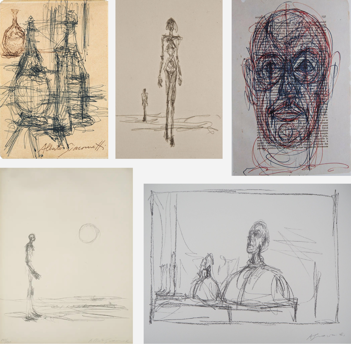
Apart from the (above) lesser works made on a lazy Sunday afternoon (I cannot escape the thought that not always he took things very serious), I guess there are also many fake Giacomettis to be seen in the various museums (click on the grey 'fake Giacomettis' to go to the text and then especially the part about Drew and Myatt of the BBC documentary). There’s really nothing to it; consequently I'd love to make fake Giacomettis.
Example is my joke: ‘Diego portrayed by Frans Hals’.
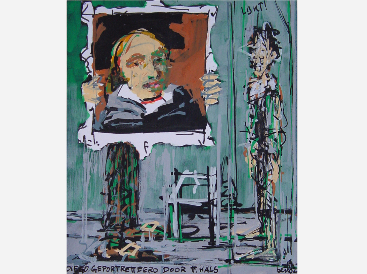
Diego: 'Looks just like me!'
For those not familiar with the works of Alberto Giacometti; he made many portraits of his brother Diego. On the left you see the two and on the right a photo of a portrait of Diego being made by Alberto.
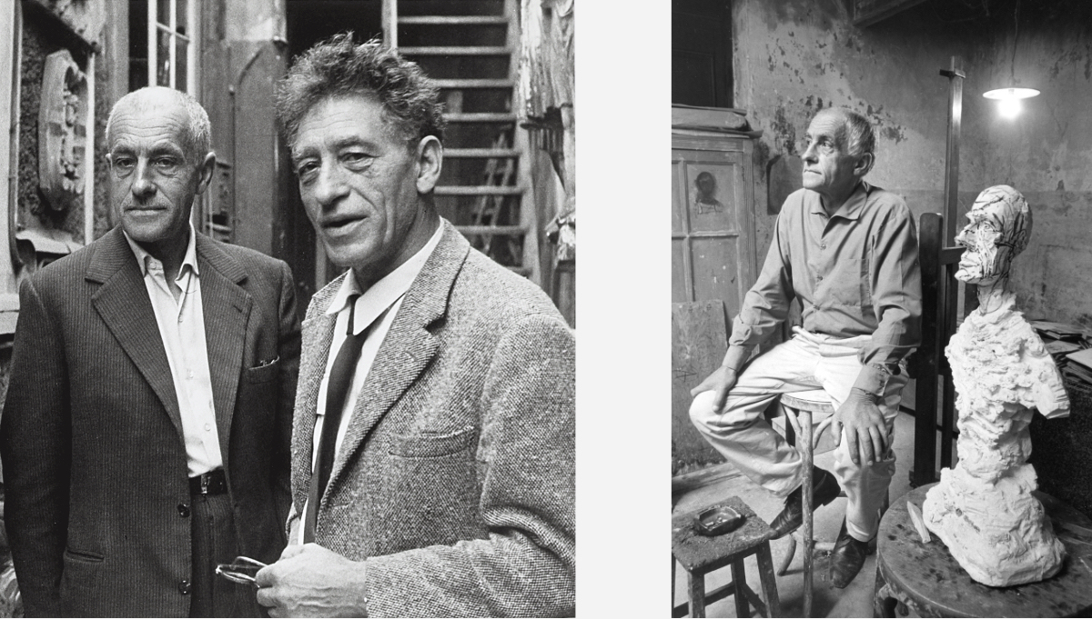
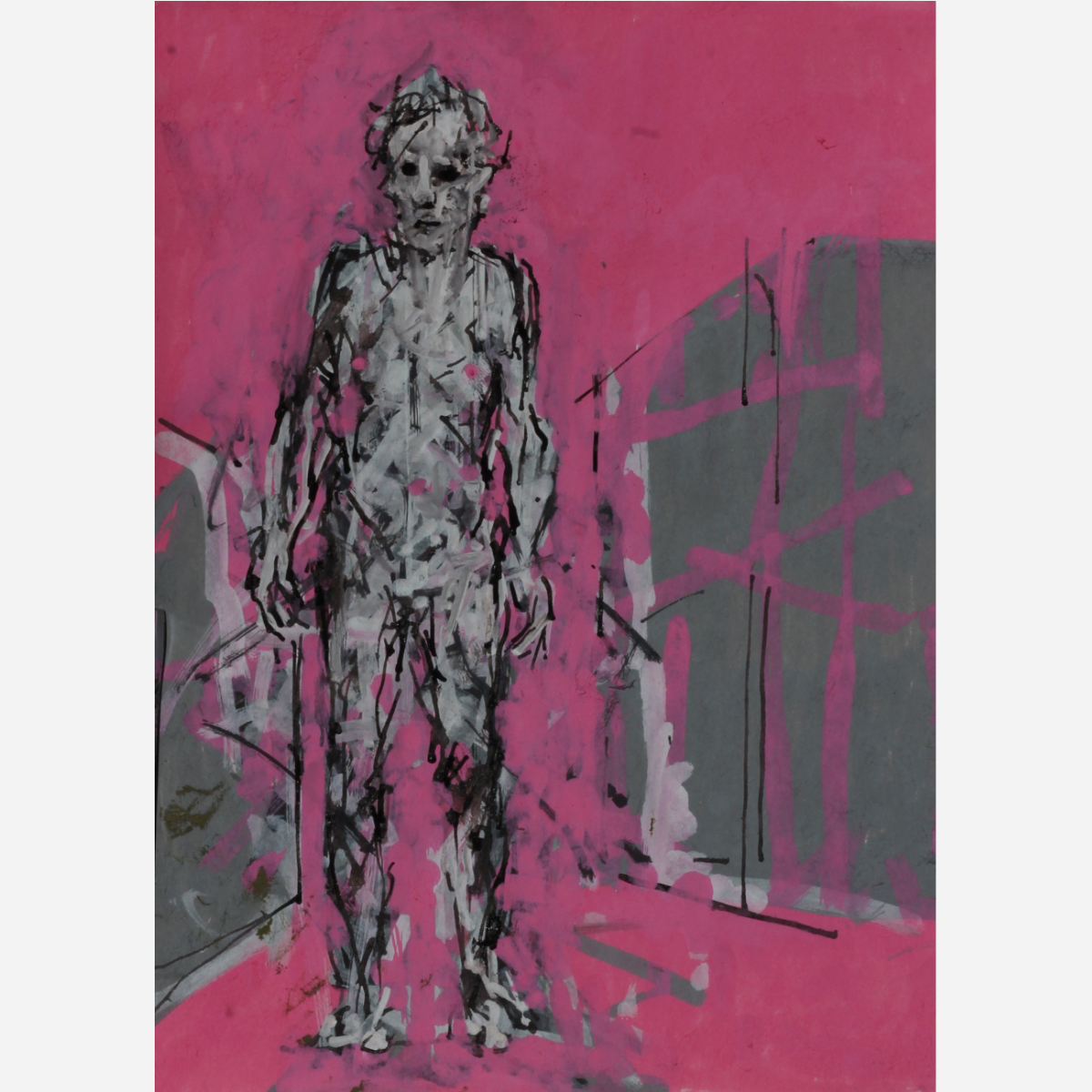
And then there is my sketch ’BLIND LADY IN PINK’, sort of made in the same style, but with more ‘Bert flavor’. Or is it the other way round? Did Giacometti try to imitate me?
Of course Giacometti didn’t try to imitate me. For two reasons; one: he is dead and two: he would never have tried to imitate an unknown artist and/or admitted that.
I notice that lately I have been criticizing quite a number of heroes in my writings/blogs.
I don’t care about reputations so when I look at a painting, it is the work that counts not who made it (and this can have nasty consequences; keep on reading).
What astonishes me is that quite some important art critics and other professionals in the field fall for fame and reputation and turn a blind eye when confronted with a piece of art that sucks but is made by a famous artist. It may seem reassuring, if made by a genius it must be great. But I try to stay away from that admiration. It doesn’t help me with my own work and I cannot help but feeling a fool if I defend a work that I find sucks.
I try to keep on looking at/doubting my own work. I have the luxury not to be famous, not to be surrounded by a crowd of blind fans.
painter on stage: ‘Thank you, thank you, thank you.'
For famous artists there are several traps they can walk into:
Self admiration: I am famous, so all I do is great also because the public wants to pay much for it. Like the drawings of Giacometti above, maybe he gave them away, maybe they were stolen, maybe he thought they were touched by his genius.
Andy Warhol cleverly walked around it. He declared himself to be the piece of art so everything he signed was genius (think about his piss paintings, he let somebody else wee over the canvasses but he signed them, so everything goes).
It just gave me an idea! If I am not mistaken, Barceló made a series of portraits by throwing acids on zinc plates. He could try to make them by peeing on the plates too (always nice to give a fellow artist a new idea)!
The art market: once famous, the art market can poison the artists mind, money can be made, loads of money, trust me!
Not every day is your day and you have to learn too: you can think that you made something great, but can discover a month/year later that this was not true… and when it is already sold: oops!
The false idea to have to fit everything in one or your style: some time ago an art collector/agent told me that he was confused, found half of my stuff totally uninteresting so he didn’t feel like working with me. This is such a ridiculous way of reasoning, why not go for what you like, trust your own judgement. If the artist makes paintings in a different style too, who cares. Sometimes artists make works with the weirdest motives.
The only artist I can think of that worked in two different styles at the same time and was totally accepted or even better admired for it was Picasso.
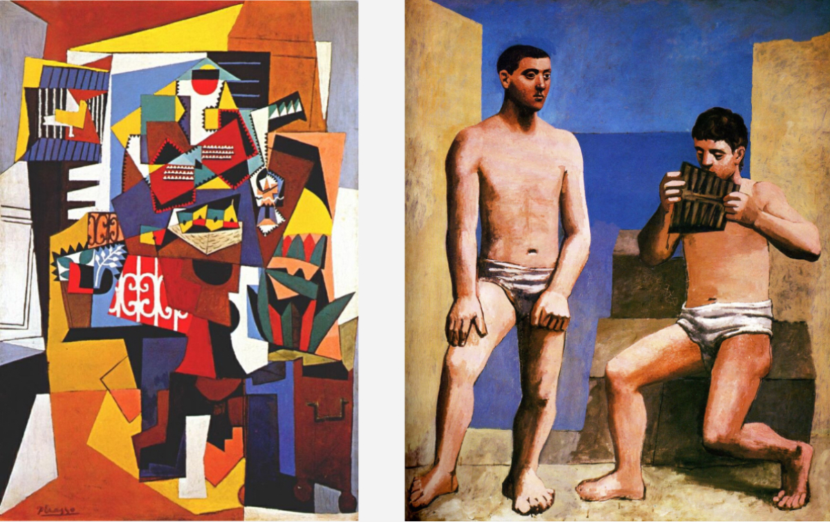
It was a bit his trade mark and the times were right for it. Still, mostly it is not appreciated.
This brought me to the common pathetic idea that a great or famous artist should automatically be a great human being. And that art makes you a better person! This is why I don't believe in art therapy.
Watch out when you meet a great artist!
The examples are many, just think of Richard Wagner, Caravaggio, Luis Ferdinand Céline, José de Ribera, Mario Sironi, Micheal Jackson, Pablo Picasso, Jackson Pollock, Carl André, Virginia Woolf, Paul Gauguin, Benvenuto Cellini, Chuck Berry, Miles Davis, Francis Bacon, Patricia Highsmith, Emil Nolde, Ezra Pound, Rimbaud, Edgar Degas, Herman Nitsch, Bernardo Bertolucci (here think about the famous scene with butter in 'Last tango in Paris'), to name a few… The list in endless.
And of course: Adolf Hitler. If only he would have succeeded as a painter…
This is why I have so many doubts about the new morals that are being asked from the artists of today. Will it destroy the arts? Will we have a better world anyway?
One can only hope that a genius artist is a dull and boring nobody…
Q: ‘What if I made a wrote a horny biography about you?’ A: ‘But I am such a boring copy of my work.’
My mind wandered off from Giacometti to… should I kill or rape somebody soon? Will that make me a better artist? Should I just be a good soul during the weekend?
Or do 'you reap just what you sow' even if you are a great artist?
11-01-2024: SUNDAY, VISITS TO EXHIBITIONS AND MUSEUMS
Sunday is the perfect day to visit exhibitions and museums. Last Sunday I saw the exhibition of Antonio López Garcia at the Pedrera. He is considered one of Spain's greatest living realistic painters.
Initially I was very impressed, but that turned into amazement here and there and I was even a bit shocked at times. Reputations mean nothing to me, the works that tell me what to think, not what others say about the artist. I was very charmed by a few of the works shown painted in the late fifties. 'Cabeza griega y vestido azul' was especially beautiful and exciting.
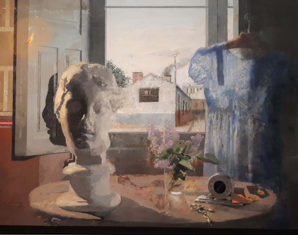
At first glance it appears to have been meticulously painted, but after some time it became apparent that the head was painted rather chaotically, and it was not correct around the nose. The cylinder on which the head sits is also incorrect. The shadow on the hatch is far from right.
Just like Cézanne he pushes and pulls on what he sees before him, only more subtle and less wooden. A painting is a painting, it is an interpretation. Delicious. Also striking were the construction lines drawn here and there in pencil.
Then there is the flame without a candle. But what surprised me were the pieces of paper stuck here and there, fragments of photos. Why?
I loved another painting made in the same period, 'Espíritu del Arte', because of the two images painted over each other.
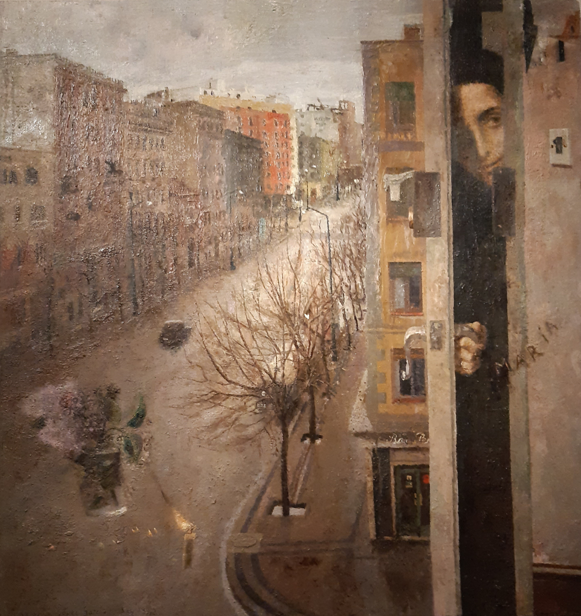
Maria opening a door, a candle floating in the street and also a glass with flowers.
In a painting everything is possible if it is done well (what is that, well done?), it is believable just as dreams can be believable.
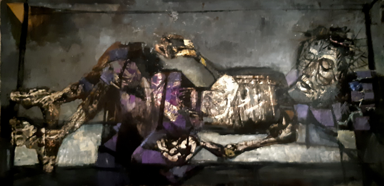
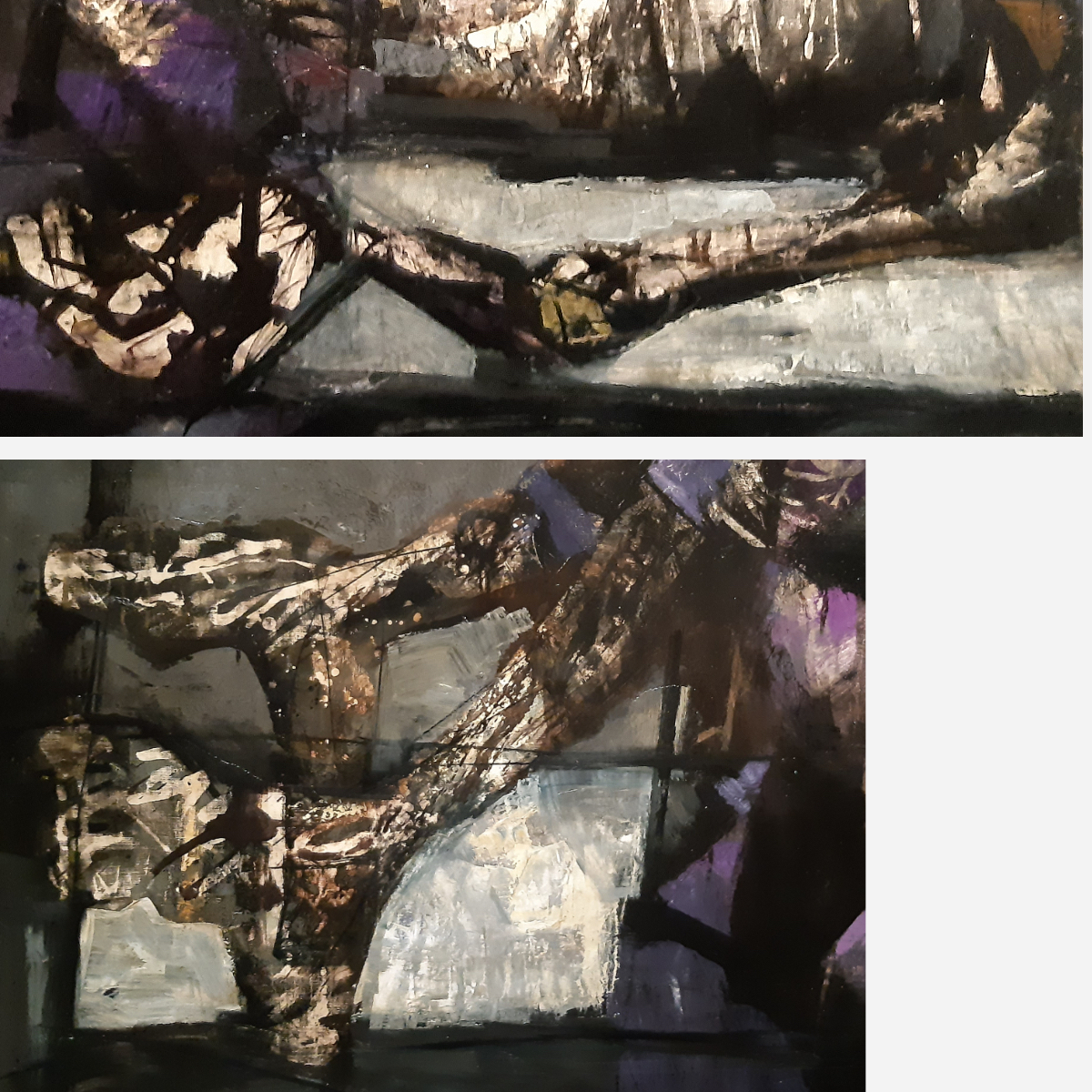
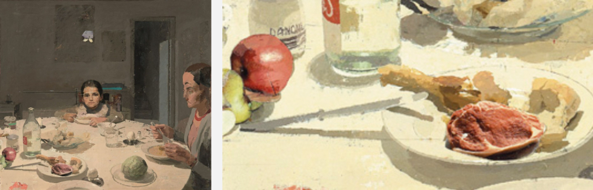
His black and white pencil drawings of interiors are beautiful. And then I stumbled on 'La Cena' (1980), a famous work of his.

See the left image. Precisely and sketchy painted alternate in a fascinating way. The head on the right bothers me, it is too out of balance. In an interview he told that he couldn't really figure it out the sizes and placing but was too tired to continue working. Not a good excuse.
But what really bothered me were the piece of meat and the apple. These are two pasted photos...
If you are honored for your inimitable realistic style, why do you make it so easy with photos? It's a betrayal to my eyes.
I noticed several times that he uses photos (he will project them on his canvases). I have no objection to that. Read 'Secret knowledge' by David Hockney, see Tim's Vermeer'. It becomes very clear with López when you see him in a few works, shaving in the bathroom and sitting on the toilet bowl.
In some works the lines are curved due to the use of a wide-angle lens and very funny, in one of the last works shown there is a mirrored text (?). Then why all these visible construction lines? He will of course work half and half, half in the studio and half on the spot looking at the subject. Especially when working on large canvases.
Who knows, maybe that form of half-heartedness actually makes his works exciting.
I admire the patience with which he creates his cityscapes, even though they become somewhat soulless here and there. Technically very clever, yes.
I remain silent about his sculptures. I also looked at his wife's paintings on the internet. She remains somewhat in his shadow. Her work has many similarities with his.
On to the MNAC, the national museum of Catalonia. The temporary exhibition there is about the years of and after the Second World War and the depiction of people in that period. At that exhibition 'Quina humanitat, la figura humana després de la guerra (1940-1960)', one painting stood out for me.
I know the work of Antoni Clavé, but he is such a painter who became trapped in his own style and way of working.
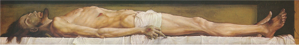
I had to move country once again and so I gave the books about his work to a friend. Maybe I should have torn out a few pages with the four works that I really like... In the MNAC, however, his 'Crist de Alba de Tormes' jumped off the wall. What a work!
He scraped away a lot of paint and that reflects the lifeless nature of Jesus' body so well. Actually, only the Isenheim altarpiece of the dead Jesus on the cross came to mind. And I still need to see that one!
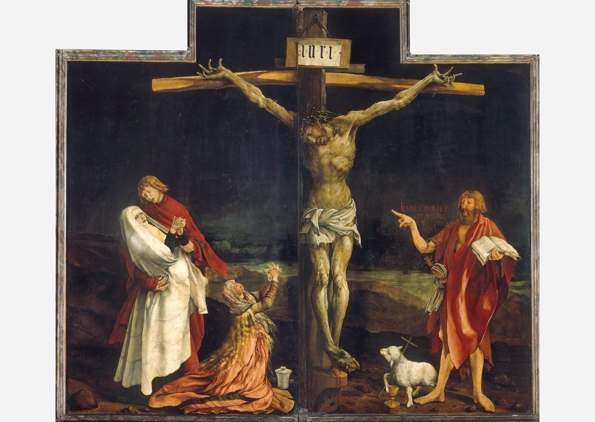
Of course there is Holbein's 'Dead body of Christ', but still...

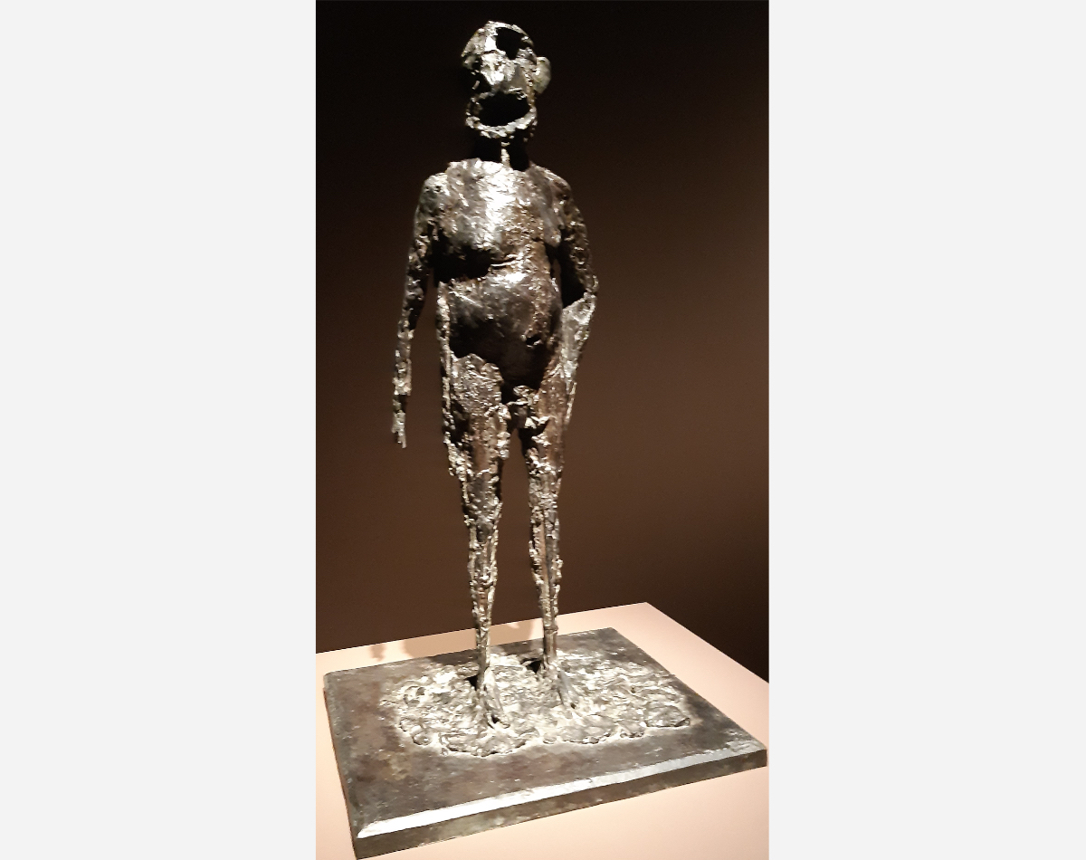
There was Henry Moore's 'Falling Warrior'. The tension in the sculpture due to the soldier's body not touching the ground reminded me of the sculpture 'Le Silence' by Nat Neujean. A sculptor I greatly admire and from whom I learned a lot. Not only in terms craftsmanship, but also his perseverance and total dedication to his work. He showed me 'Le Silence' and said that because the figure had been tortured he could not keep his foot on the ground because of the pain.
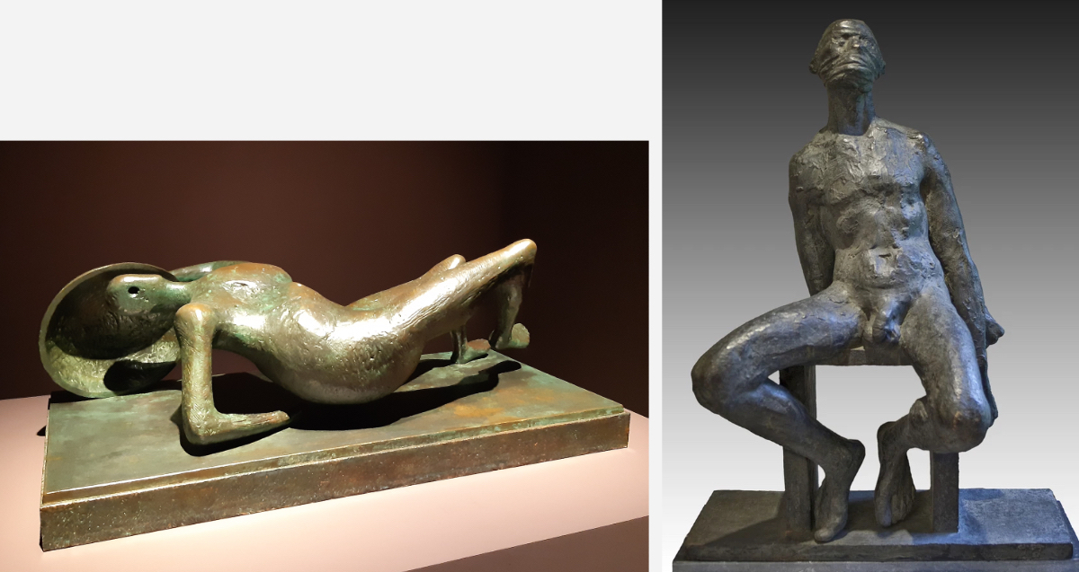
Nat made the portrait of Henry Moore, but was not very impressed by the sculptor… oh well…
Another image that touched me was 'L'Orge' by Germaine Richier. I am too young to have experienced the years immediately after the Second World War, but I can imagine the grayness of that time.

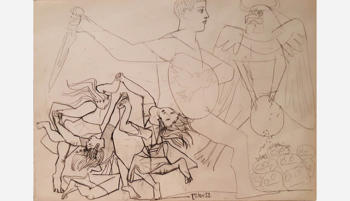
Picasso's sketch was a surprise. Sometimes I think he was stronger in his drawings.
The works closer to the sixties became increasingly meaningless to me. Long live 'creativity', 'playfulness'... Cute, but it didn't do much for me. I visited the Stedelijk Museum too often in the seventies and eighties. Shame.
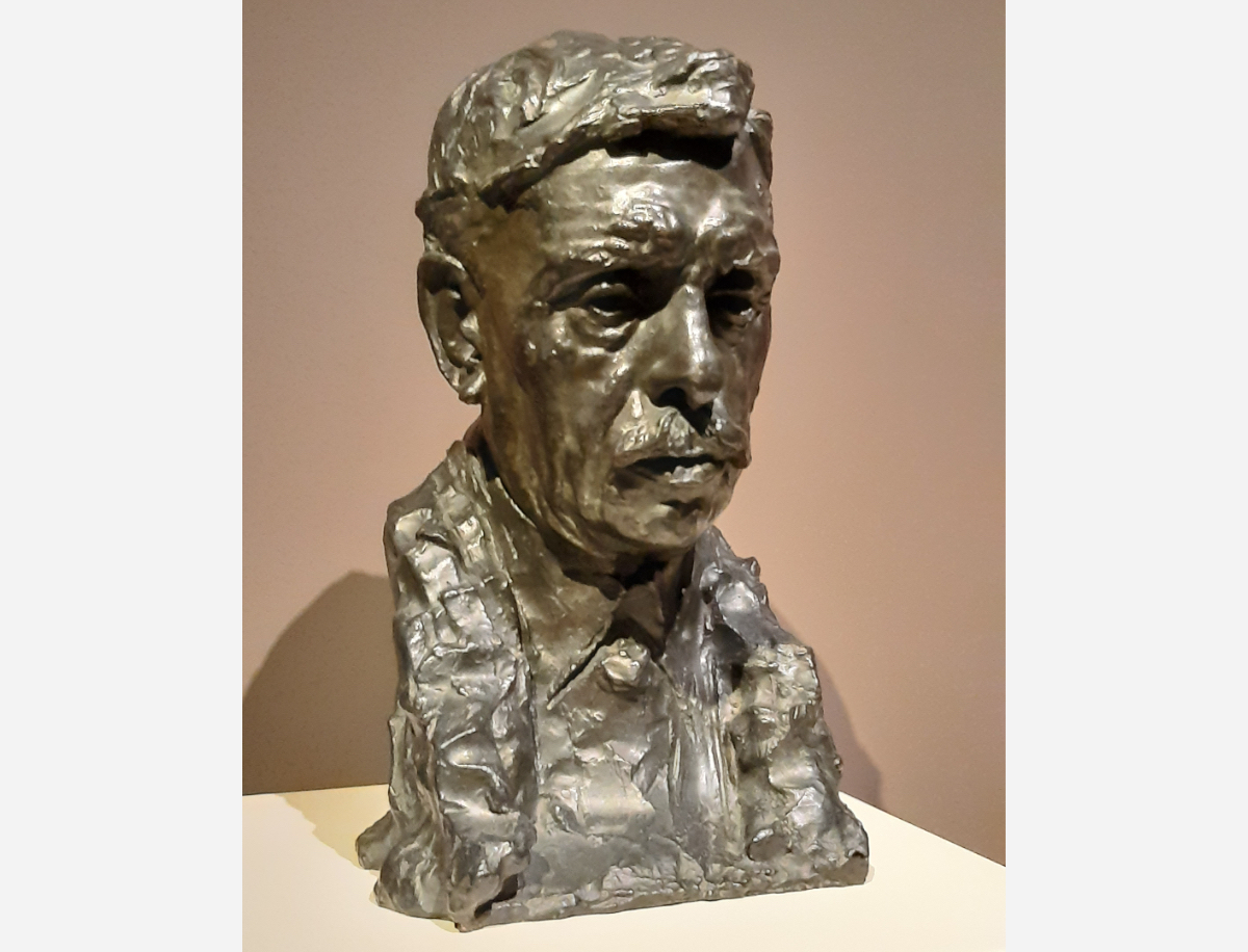
On to the museum's permanent collection. I always salute Josep Gimenez. A seriously underrated painter. The MNAC has a few works by him and I have searched several times for a decent catalog but have never found one.
This beautiful bust made by Rodin is near the self-portrait of Gimenez.
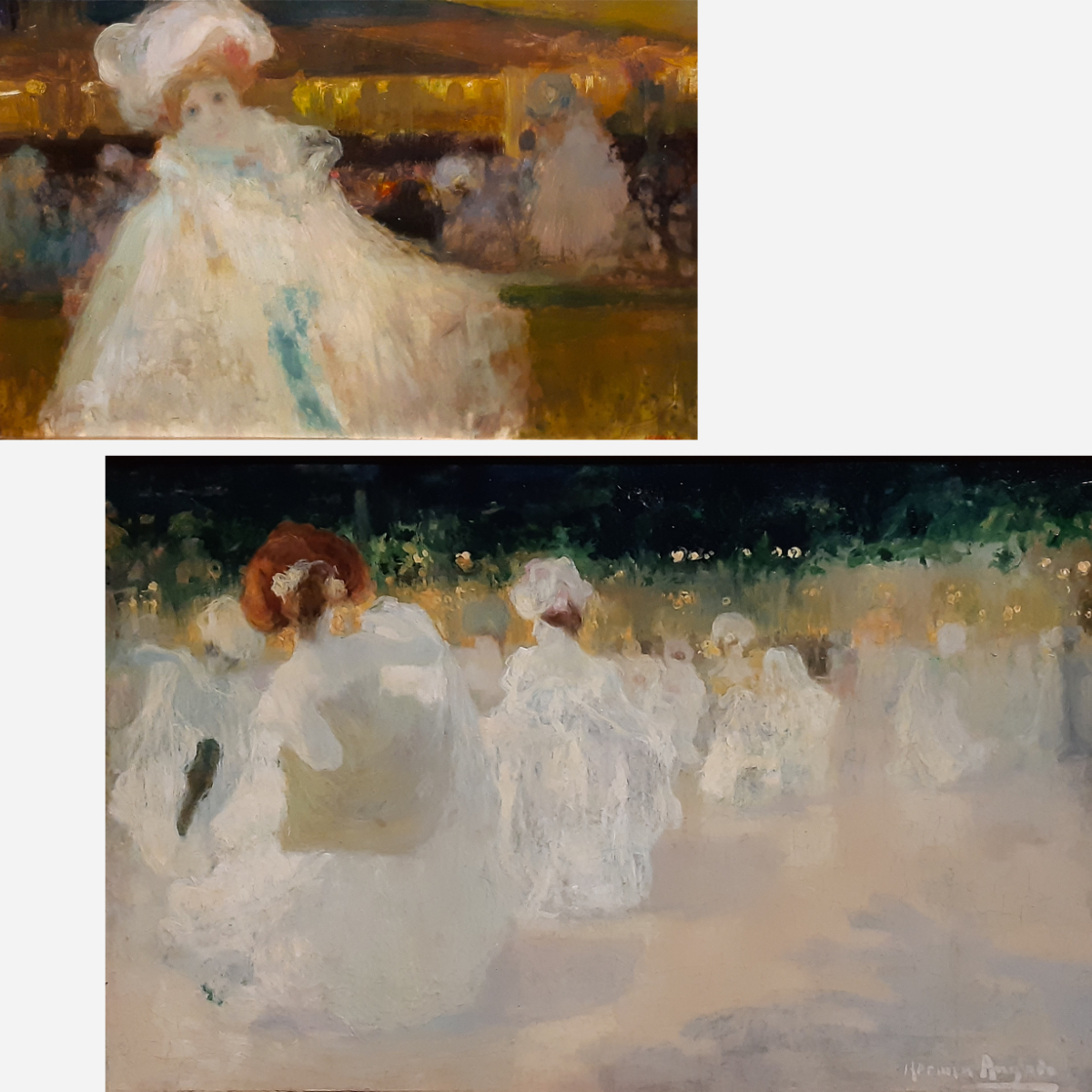
Next stop: Hermen Anglada Camarasa. One of the two large female portraits is still (I hope) being restored. Here I show two of the three small paintings in another room. I cannot escape the impression that he, living in the time of the bohemians, must have used morphine to create these kinds of atmospheres in these works. I read that he is compared to Klimt; I find his work more interesting, more painterly.
And then the wonderful female portrait by Romà Ribera. What a beautiful use of that glowing undertone.
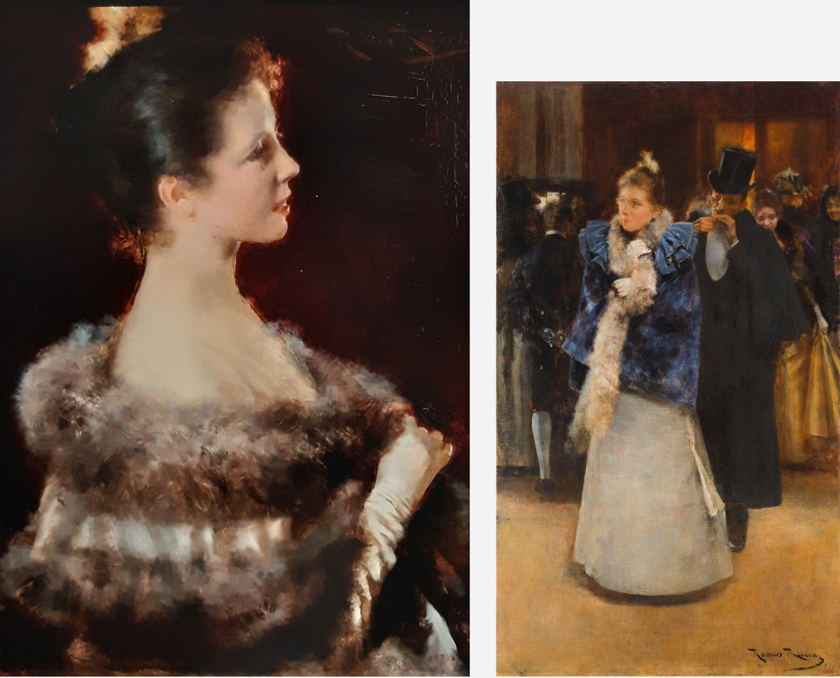
'Salida del baile' also has that glow.
I walked 'back in time', started with the latest era.
It was closing time, unfortunately.
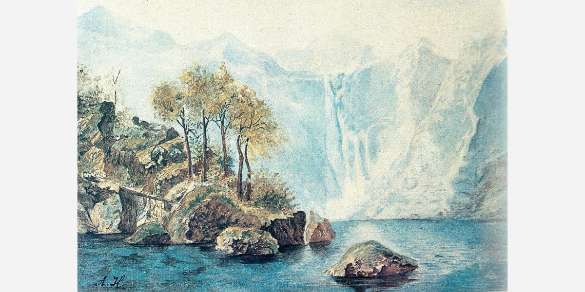
I would like to show two more works. But more as a curiosity than as remarkable or beautiful. First of all, 'La dama del xal de puntes' by Adolf Münzer...

Long ago my grandfather (a furniture maker) went to a world exhibition to get ideas. He had bought catalogs and because I loved drawing so much, they were given to me after his death. This was in the sixties and we were squeamish. In one of these catalogs I saw naked women for the first time! Painted, but still. One of the images was of this lady.
Finally, there is the ornament, the 'Capitel amb la alegoria de la fotografia'. In 1900, the architect Puig i Cadafalch designed the house for the Amatller family. It was the period of many inventions, including photography. To celebrate this, Eusebi Arnau made this capital.

For years I thought that the name Kodak had to do with the sound these first cameras made, but alas. I am once again deprived of an illusion, Kodak comes from Nodak, as the cameras were initially to be called after their place of origin: North Dakota. The better sounding Kodak was chosen…
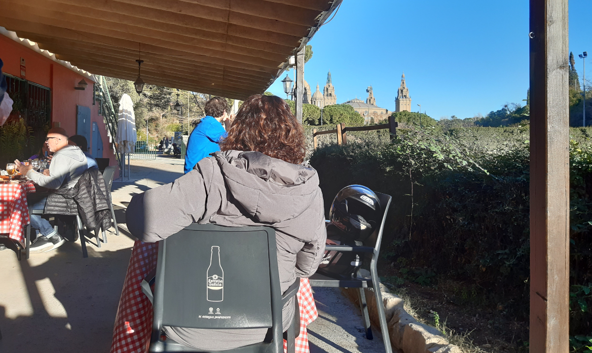
To eat and drink away my sadness (I'm lying here of course) I walked to the restaurant close to the MNAC. 'La Foixarda' has changed owner and is now called 'Petit Hipica'. The food is ok, what matters to me is the location. A lunch on a sun-drenched Sunday afternoon, a worthy ending.

As an accompanying video I chose 'THE GREAT GATE OF KIEV' by Mussorgsky, very bitter when you think of the title of the exhibition in the MNAC and these times...
08-01-2024: ZONDAG EN OP STAP
Zondag is de perfecte dag om tentoonstellingen en musea te bezoeken. Afgelopen zondag zag ik de tentoonstelling van Antonio López Garcia in de Pedrera.
Hij wordt gezien als een van de grootste realistische nog levende schilders van Spanje. Aanvankelijk was ik zeer onder de indruk, maar dat veranderde hier en daar in verbazing en ik was soms zelfs wat geschokt. Reputaties zeggen me niets, het zijn de werken die me vertellen wat te denken, niet wat anderen over de kunstenaar beweren.
Ik was zeer gecharmeerd van een paar getoonde werken geschilderd in de laat vijftiger jaren. Vooral ‘Cabeza griega y vestido azul’ was mooi en spannend.

Bij eerste aanblik lijkt het minutieus geschilderd, maar na enige tijd viel op dat de kop nogal chaotisch geschilderd is, rond de neus klopt het niet. Ook de cilinder waarop de kop staat is incorrect. De schaduw op het luik klopt zelfs van geen kant.
Zoals ook Cézanne duwt en trekt aan wat hij voor zich ziet, alleen subtieler en minder houterig. Een schilderij is een schilderij, het is niet de werkelijkheid, het is een interpretatie. Heerlijk. Wat verder opviel waren de hier en daar nog met potlood getekende constructielijnen.
Dan is er de vlam zonder kaars. Maar wat me verbaasde zijn de hier en daar opgeplakte papiertjes, fragmenten van foto’s. Waarom?
Een ander in diezelfde periode gemaakt schilderij ‘Espíritu del Arte’ vond ik prachtig vanwege de twee over elkaar geschilderde afbeeldingen.

Maria een deur openend, een kaars zwevend in de straat en ook een glas met bloemen.
In een schilderij kan alles als het goed gedaan is (wat is dat; goed gedaan?), is het geloofwaardig zoals ook dromen geloofwaardig kunnen zijn.
Zijn met potlood gemaakte zwart-wit tekeningen van interieurs zijn schitterend. En toen viel ik op ‘La Cena’ (1980), een beroemd werk van hem.
Zie de linker afbeelding. Af en onaf wisselen elkaar op een fascinerende manier af. Toch stoort mij het hoofd rechts; het is teveel uit balans. In een interview zegt hij er over dat hij er niet echt goed uitkwam en te moe was om aan het werk door te gaan.
Maar wat me echt stoorde waren het stuk vlees en de appel. Het zijn twee opgeplakte foto’s…
Als je geëerd wordt om je onnavolgbare realistische stijl, waarom maak je je er dan zo gemakkelijk af met foto’s? Het is mijn ogen verraad.
Verder viel het me meerdere malen op dat hij foto’s gebruikt (hij zal die projecteren op zijn doeken). Op zich heb ik daar geen enkel bezwaar tegen. Lees ‘Secret knowledge’ van David Hockney, zie Tim’s Vermeer’. Het wordt bij López duidelijk als je in een paar werken hem zelf ziet, zich scherend in de badkamer en zittend op de wc-pot. In sommige werken lopen de lijnen krom vanwege het gebruik van een groothoeklens en heel grappig, in een van de laatst getoonde werken staat een tekst in spiegelbeeld (?). Alles heel in orde, maar waarom dan al die zichtbare constructielijnen? Hij zal natuurlijk half en half werken, half in de studio en half ter plekke kijkend naar het onderwerp. Zeker als het om grote doeken gaat.
Wie weet maakt die vorm van halfslachtigheid zijn werken juist spannend.
Al met al heb ik bewondering voor het engelengeduld waar hij zijn stadsgezichten mee maakt, maar soms vind ik ze wat zielloos. Technisch zeer knap, dat wel.
Over zijn beelden zwijg ik. Ook heb ik op internet naar de schilderijen van zijn vrouw gekeken. Ze blijft een beetje in de schaduw van hem. Haar werk heeft veel overeenkomsten met het zijne.
Op naar het MNAC, het rijksmuseum van Catalonië. De tijdelijke tentoonstelling aldaar gaat over de jaren van en de eerste na de Tweede Wereldoorlog en de afbeelding van mensen in die periode. Op die tentoonstelling ‘Quina humanitat, la figura humana després de la guerra (1940-1960)’ sprong er voor mij een schilderij uit.
Ik ken het werk van Antoni Clavé, maar het is zo’n schilder die gevangen raakte in zijn eigen stijl, manier van werken.
Ik moest weer eens verhuizen en toen heb ik de boeken over zijn werk aan een vriend gegeven. Misschien had ik een paar bladzijden met de vier werken die ik echt mooi vond er uit moeten scheuren…
In het MNAC echter sprong zijn ‘Crist de Alba de Tormes’ van de wand. Wat een doek!


Hij schraapte veel verf weer weg en dat geeft het ontzielde van het lichaam van Jezus zo goed weer. Mij schoot eigenlijk alleen het Isenheimer altaarstuk van de dode Jezus aan het kruis te binnen. En dat moet ik nog steeds gaan zien!

Natuurlijk ook het ‘Dead body of Christ’ van Holbein, maar toch…
En dan was er de ‘Falling Warrior’ van Henry Moore. De spanning die er in het beeld zit omdat de soldaat de grond met zijn lichaam niet raakt deed me denken aan het beeld ‘Le Silence’ van Nat Neujean. Een door mij zeer bewonderde beeldhouwer van wie ik veel heb geleerd. Niet alleen voor wat betreft zijn vakmanschap, maar ook zijn doorzettingsvermogen en totale toewijding aan zijn werk. Hij toonde mij 'Le silence' en vertelde dat omdat de figuur gemarteld was hij zijn voet niet op de grond hield vanwege de pijn.

Nat heeft ooit het portret van Henry Moore gemaakt, maar was niet erg onder de indruk van de beeldhouwer… tja…
Nog een beeld dat mij raakte was ‘L’Orge’ van Germaine Richier. Ik ben te jong om de jaren direct na de Tweede Wereldoorlog mee te hebben gemaakt, maar de grauwheid van die tijd kan ik mij voorstellen.
Een verassing was de schets van Picasso. Soms denk ik dat hij sterker was in zijn tekeningen.

De werken meer richting de zestiger jaren werden voor mij steeds betekenislozer. Lang leve de ‘creativiteit’, de ‘speelsheid’. Schattig, maar het deed me weinig. Ik heb te vaak door het Stedelijk Museum gelopen in de zeventiger en tachtiger jaren. Jammer.
Op naar de vaste collectie van het museum. Ik groet altijd Josep Gimenez. Een zwaar ondergewaardeerde schilder. Het MNAC heeft een paar werken van hem en ik ben meerdere malen op zoek gegaan naar een fatsoenlijke catalogus maar heb die nooit gevonden.

In de buurt van zijn zelfportret is ook deze prachtige buste gemaakt door Rodin.

Door naar Hermen Anglada Camarasa. Een van de twee grote vrouwenportretten wordt nog steeds (hoop ik) gerestaureerd. Ik toon hier twee van de drie kleine schilderijtjes in een andere zaal. Ik kan niet ontkomen aan de indruk dat hij, levende in de tijd van de bohemiens, morfine moet hebben gebruikt om tot dit soort sferen te komen in deze werken. Ik las dat hij vergeleken wordt met Klimt; ik vind zijn werk interessanter, schilderkunstiger.

En dan het heerlijke vrouwenportret van Romà Ribera. Wat een prachtig gebruik van die gloeiende ondertoon.

Ook ‘Salida del baile’ heeft die gloed.
Ik liep ‘terug in de tijd’, was begonnen bij de nieuwste tijd.
Het liep tegen sluitingstijd, helaas.
Nog twee werken wil ik laten zien. Maar meer als curiositeit dan als opmerkelijk of mooi. Allereerst ‘La dama del xal de puntes’ van Adolf Münzer..
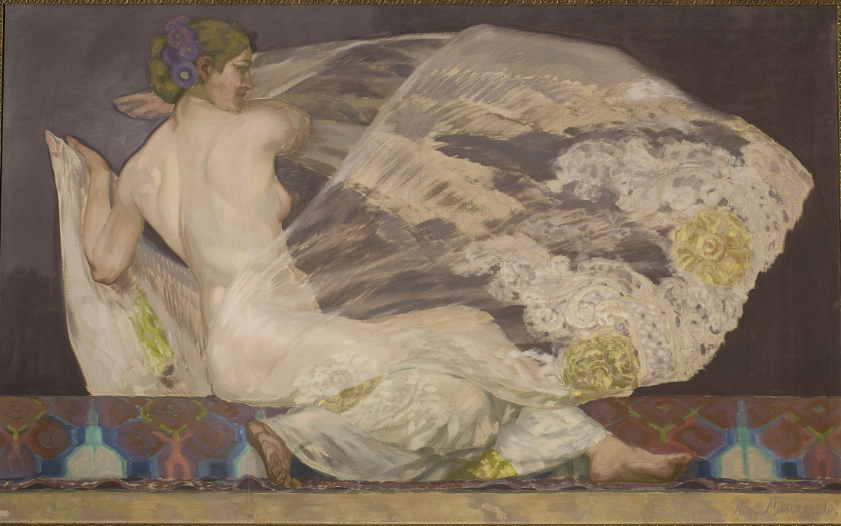
Ooit was mijn opa (een meubelmaker) naar een wereldtentoonstelling gegaan om ideeën op te doen. Hij had daar catalogi gekocht en omdat ik zo van tekenen hield werden die na zijn overlijden aan mij gegeven. Het waren de zestiger jaren en we waren preuts. In een van die catalogi zag ik voor het eerst naakte vrouwen! Weliswaar geschilderd, maar toch. Een van de afbeeldingen was van deze dame.
Als laatste is er het ornament, het ‘Capitel amb la alegoria de la fotografia’. In 1900 ontwierp de architect Puig i Cadafalch het huis voor de familie Amatller. Het was de tijd van de vele uitvindingen waaronder de fotografie. Om dat te vieren maakte Eusebi Arnau dit kapiteel.
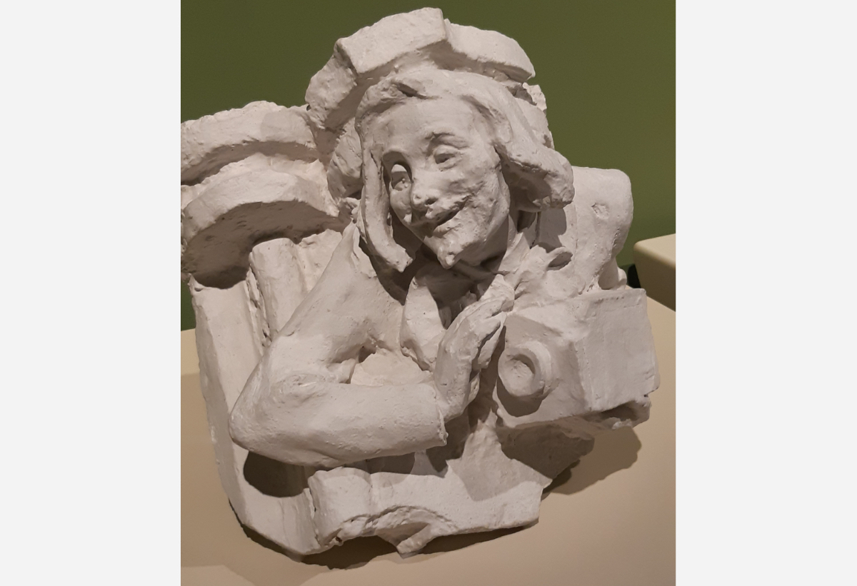
Ik heb jaren gedacht dat de naam Kodak te maken had met het geluid dat die eerste camera’s maakten, maar helaas. Ik ben weer een illusie armer, Kodak komt van Nodak, zoals de camera’s aanvankelijk zouden worden genoemd naar de plaats van herkomst: North Dakota. Er werd gekozen voor het beter klinkende Kodak…
Om mijn verdriet weg te eten en drinken (ik lieg hier natuurlijk) ben ik naar het dicht bij het MNAC liggende restaurant gelopen. ‘La Foixarda’ is in andere handen over gegaan en heet nu ‘Petit Hipica’. Het eten is ok, het gaat mij om de locatie. Een lunch op een zonovergoten zondagmiddag, een waardige afsluiting.
Als begeleidende video heb ik gekozen voor 'DE GROTE POORT VAN KIEV' van Mussorgsky, erg wrang als je denkt aan de titel van de tentoonstelling in het MNAC en het nu...